Why R
R is one of the most complex and sophisticated statistical software. Similarly, the current acceptance of the software is high in many fields and work lines. There is an infinite number of applications with R; linear regressions, spatial analysis, graphs, books, journals, web pages, even APPs have been created with R in the last few years. Scientists are constantly updating the program and other packages to make user interaction more friendly and more accessible for more users. We can work with CSS, HTML, markdown, Python in one file as their motto says it truly is "How we think about Data Science". Many clever and intelligent people with solid R knowledge use R to make statistical software with buttons and clicks for easy and fast results.
In these documents, we will provide you with the code required to replicate the main graphs given to you during the course. Additionally, the significant parts and elements of the code have some explanations about the role and function so you can understand it better and follow it nicely. At the same time, you will be familiar with a program that is an excellent skill in the field of environmental science, programming, and statistics in general.
Pareto Chart
We mentioned that figures are important, in these posts we will give you some tips and code to create some graphs with R.
First, we need a data set.
#install.packages(qcc) #Remove the first # and run to install a package that will let you plot the pareto Chart
x=c(4,5,8,7) #values
names(x)=c("something","B","C","D") #groups
#let's look how x data is looks like
x
## something         B         C         D
##         4         5         8         7
Here each value of x has a group name, so we can plot x with qcc::pareto.chart.
library(qcc) # to use all the functions from that package run the library(package_name) once per session
pareto.chart(data = x,
             ylab="Change (Million People)",
             ylab2="Cumulative Percentage")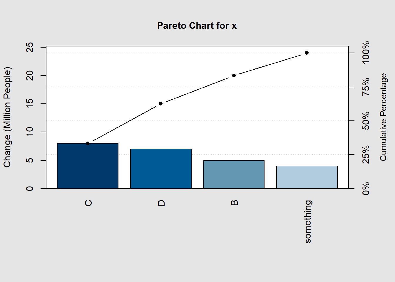
##
## Pareto chart analysis for x
##             Frequency Cum.Freq. Percentage Cum.Percent.
##   C           8.00000   8.00000   33.33333     33.33333
##   D           7.00000  15.00000   29.16667     62.50000
##   B           5.00000  20.00000   20.83333     83.33333
##   something   4.00000  24.00000   16.66667    100.00000
The output will be the graph and the data summary.
Usually, we work with a wide data set and you may want to do the plot for x variable then we can do the following:
df<-data.frame(rain=c(4,5,8,7), #values
               temperature=c(2.5,3.1,4,5),
               group=c("A","B","C","D")) #groups
df #have a look at the df
##   rain temperature group
## 1    4         2.5     A
## 2    5         3.1     B
## 3    8         4.0     C
## 4    7         5.0     D
#let's set the data the way needed for the plot with pareto.chart()
x=df$rain # take the info in a variable from the df data frame to x
names(x)<-df$group # get the values from the df data frame to x
pareto.chart(x) #plot the graph 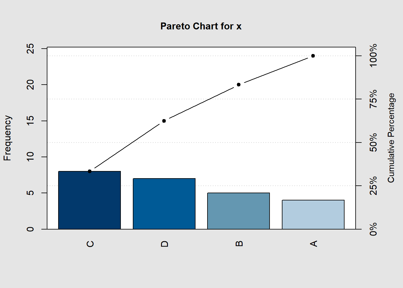
##
## Pareto chart analysis for x
##     Frequency Cum.Freq. Percentage Cum.Percent.
##   C   8.00000   8.00000   33.33333     33.33333
##   D   7.00000  15.00000   29.16667     62.50000
##   B   5.00000  20.00000   20.83333     83.33333
##   A   4.00000  24.00000   16.66667    100.00000
The Grammar of Graphics: ggplot2
There is no better package for graphics than ggplot2; many of the new functions, packages, and other programs in Rstudio aim to build data results compatible with ggplot2. Therefore, if you want to learn something about R, ggplot2 is the right package to learn.
Data requirements for ggplot2 graphs
- First, something important to mention is that all the data required for figures created with ggplot2 must be inside a variable. If x is not already a
data.frame, ggplot2 will join or convert all the information into one dataset byfortify().
#install.packages("tidyverse")
library(tidyverse)
#show the first 3 lines of the diamond data set
head(diamonds,3)
## # A tibble: 3 x 10
##   carat cut     color clarity depth table price     x     y     z
##   <dbl> <ord>   <ord> <ord>   <dbl> <dbl> <int> <dbl> <dbl> <dbl>
## 1  0.23 Ideal   E     SI2      61.5    55   326  3.95  3.98  2.43
## 2  0.21 Premium E     SI1      59.8    61   326  3.89  3.84  2.31
## 3 0.23 Good E VS1 56.9 65 327 4.05 4.07 2.31- In R, there is no right or wrong data-style; we will learn to change the structure of data sets, filter, select, or arrange your file differently.
- We will give you some tips to create better files for R and R-studio. So you can save some time and do a lot of things in one run.
Pareto Chart with ggplot2
As aforementioned, some packages have updated the old version to match the syntax of ggplot2 like the following example.
#install.packages(c("ggQC","gcookbook","tidyverse")) #the new qcc package for ggplot graphs
library(ggQC)
library(gcookbook) # for the data set
library(ggplot2)
data("uspopchange") # let's use the change in population in America as and example
#uspopchange
usa.pop<-uspopchange[1:10,] # there are a lot of states so we can just take the first 10 states for the example data set
# let's look at the first 2 rows of the data set
head(usa.pop,2)
##     State Abb Region Change
## 1 Alabama  AL  South    7.5
## 2  Alaska  AK   West   13.3
Now, the data is in a data frame style; we have many variables so that we can make different graphs with different response variables.
p=ggplot(data = usa.pop,mapping = aes(x=State,y=Change))+
  ggQC::stat_pareto(point.color = "red",
                    point.size = 3,
                    line.color = "black",
                    bars.fill = c("steelblue","tomato"))+ #fill of the bars is continuous therefore you need to set the first and last and you will get a gradient for all the bars
 theme_bw() #remove the background color and keep the major and minor axis and some other plot structures
usa.pop=usa.pop[order(usa.pop$Change,decreasing = T),] #order the data set by the values of Change in a decreasing order
usa.pop$State<-factor(usa.pop$State,levels = usa.pop$State) #countries labels in the right place
This plot clearly looks much better with more control over the elements. There are a few things that we can change to make them better, like labels better axis, a legend because a double y-axis can mislead the readers. We will use all the data set in the following example as R is better at working with large data sets.
#install.packages(scales) # use the percent and other notation on the axis
p +
  scale_y_continuous(breaks = c(0,50,100,sum(usa.pop$Change)), # we need to control the left y axis breaks
                     sec.axis = sec_axis(~./sum(usa.pop$Change)*100, #this is Cumulative Sum(y)/sum(all states in change)*100 (%)
                                         breaks = c(0,15,25,50,75,100), # which breaks do you want to show
                                         labels = scales::percent_format(scale = 1), #from the package scales use :: percent, we need to use percent_format(scale=1) because transform the axis in 100 already
                                         name = "Country Cumulative Change"))+ # give it a name
  geom_text(aes(label=Change),nudge_y = ifelse(usa.pop$State%in%c("Connecticut","Alabama"),4,-5),color="black",size=4)+
  labs(title="Pareto Chart",y="Population Change (million people)")+
  theme_bw(base_size = 13,base_family = "serif")+#sans= Arial, mono= Courier, serif= Times New Roman
# This is nearly perfect yet the legend is not showing in our figure so we can add it ourselves
# first, we will need need to have a data set that can be used to add a legend to the figure
  geom_point(mapping=aes(x=1,y=130),color="red",size=3)+ #point
  annotate("text",x=1.3,y=130,label="Cumulative Change",
             hjust="left", #text starts from the x,y place
             color="black")+ #text color
   annotate("rect",xmin=0.8,xmax=1.2,ymax=127,ymin=133,alpha=0.5,color="black",fill="pink") #build a box to avoid confusion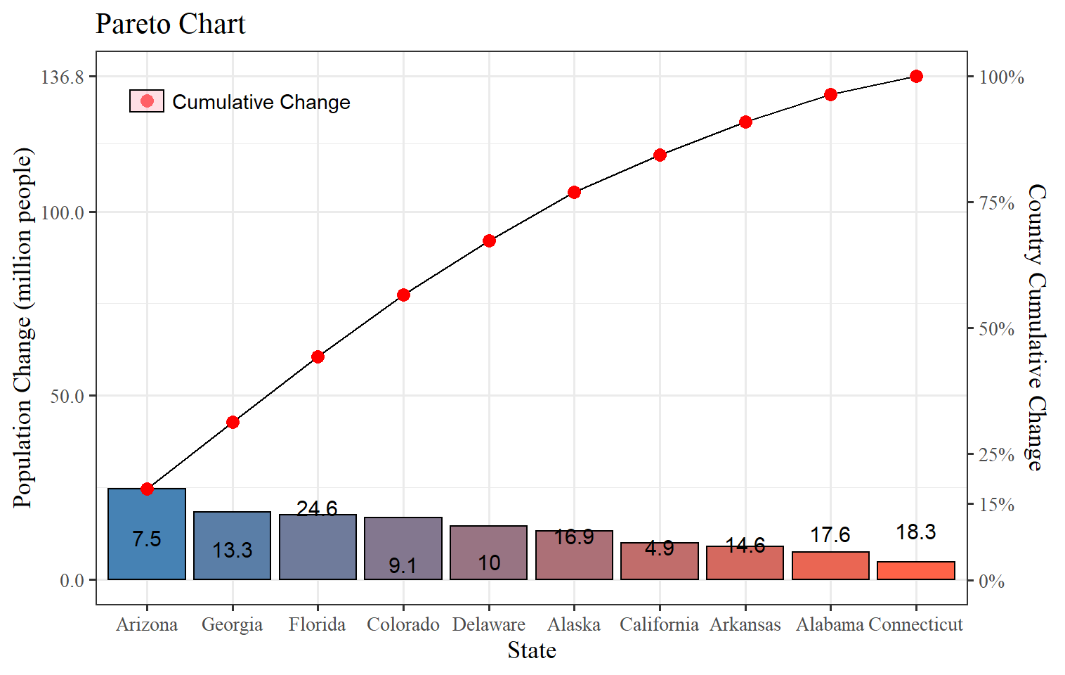
Here, we have complete control of the elements of the plot. It may look like a lot of work now, but once you get familiar with the sentence functions and features, it will be more accessible, and of course, that will be very useful because many plots will use the same coding structure in the R universe. Now, despite it takes more than a few clicks to get our Pareto Chart in, you added more knowledge like:
- Order data sets by different variables.
- Add a second y-axis.
- Change the labels, breaks of the axis (for x axis just replace y with x).
- Give better axis labels.
- Add text inside figures and for each level of the category.
- Change the theme of the plots.
- Change the text font family, color, and size.
- Add points text rectangles to build unique legends.
Histograms
Histograms help you to visualize the approximate distribution of your data. It is similar to the bar plot, but we can change the number of bins that we want to display; depending on the number of observations, we may need more or less. The default number of bins is 30; it will do the job for large data sets, while small data sets can use smaller bins to avoid gaps. We will use geom_histogram and other parameters depending on your needs.
ggplot(diamonds,aes(x=price))+
  geom_histogram(bins = 45,fill="steelblue",color="black")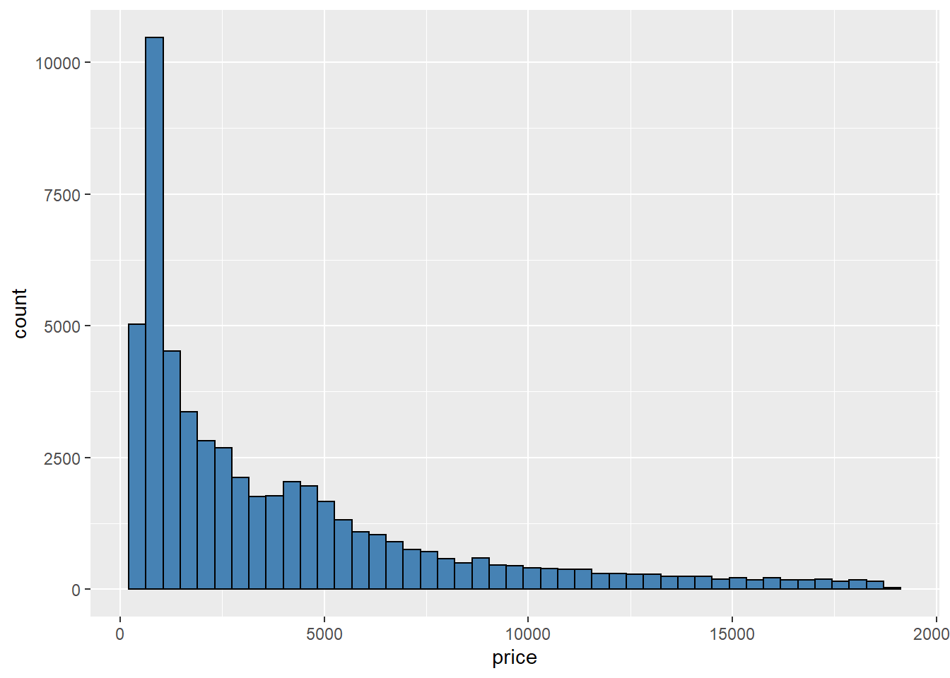
We have other options like binwidth, which defines the width of each bin to the selected value in units of x. In the example above, we said to draw 45 bins, and now we want as many bins as long each is 2 x units.
#install.packages(UsingR) # get the data set
library(UsingR)
ggplot(father.son, aes(x = fheight*2.54)) +      # units transformation
  geom_histogram(aes(y = ..density..),fill="grey80",binwidth = 2) +  #bins each 2cm height
  geom_density()+ #density distribution on top of the histograms
  theme_light()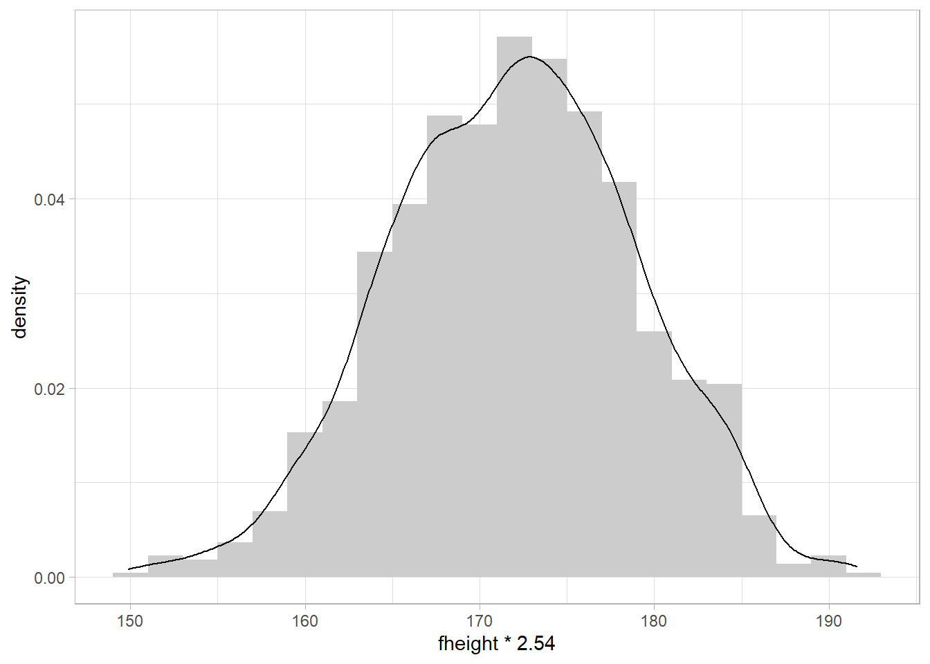
Box plots
They are great ways to represent the distribution of the data. Boxplots are extremely good at that as we can easily see the median, interquartile range (IQR), minimum, maximum values, and any outlier presented in the data.
We will plot the height of the characters from the Star Wars saga grouped by their genders.
#install.packages("ggsci")
library(ggsci) #many color palette
ggplot(starwars, aes(x = gender, y = height)) +
  geom_boxplot(aes(fill=gender))+ # fill each boxplot by gender
  scale_fill_aaas(alpha = 0.8) # add some transparency to the fill color 0.2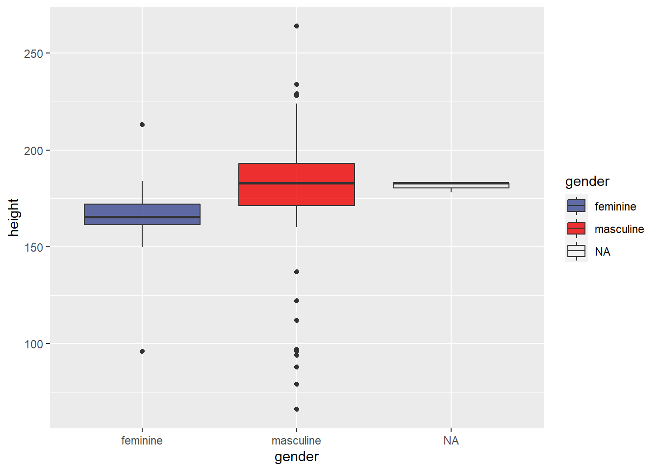
QQ plot
Lastly, one very important scatter plot uses the function geom_qq, which creates QQ plots to check the normality of the data; it compares the empirical distribution to a theoretical one. Use geom_qq() and geom_qq_line() and the **sample= variable**.
#install.packages(gcookbook)
#install.packages(gapminder)
library(gcookbook)
library(gapminder)
#normally distributed
ggplot(heightweight, aes(sample = heightIn)) +
  geom_qq() + #points
  geom_qq_line() #line

#not normally distributed
ggplot(gapminder, aes(sample = lifeExp)) +
  geom_qq() +
  geom_qq_line()+
  facet_wrap(.~continent,nrow = 2)+
  theme_test()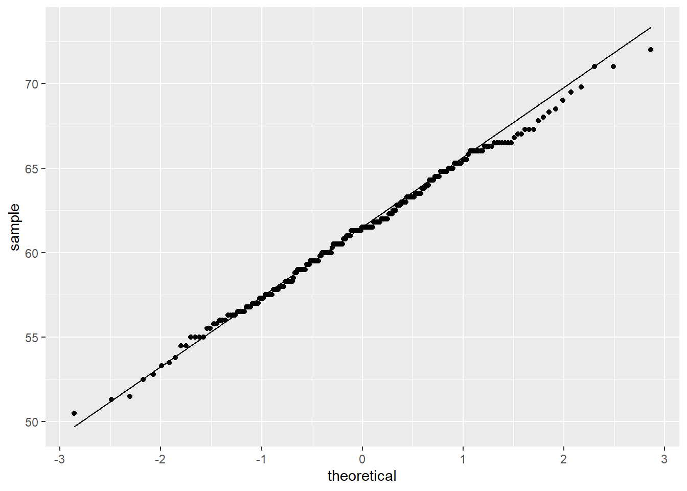
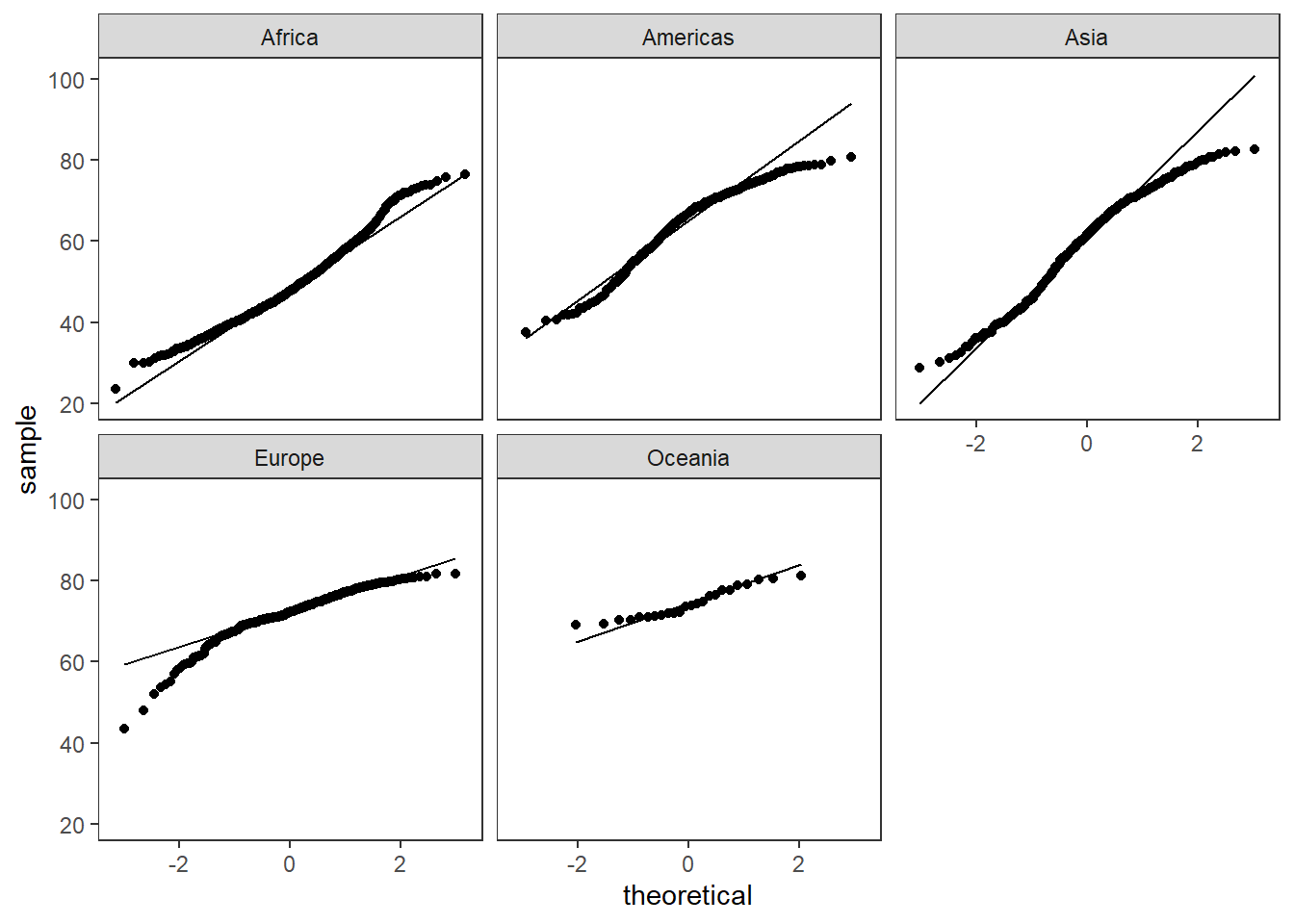
Figure 1: QQ plot for normally distributed data (left), not normally distributed (right)
With facet_*, we can separate the data and have different groups and many different graphs.
Cumulative Distribution Function (CDF)
The cumulative distribution function (CDF) of a real-valued random variable X, or just distribution function of X, evaluated at x, is the probability that X will take a value less than or equal to x.
ggplot(uspopchange,aes(x=Change))+
  geom_histogram(bins = 10,fill="steelblue",color="black")
#graphs shows some skewness
#install.packages("spatstat")
 library(spatstat)
 b <- density(runif(uspopchange$Change)) #need to transform the data to
 f <- CDF(b) # calculate the CDF of the population change in america
 plot(f) # does not follow a normal distribution we should do some transformations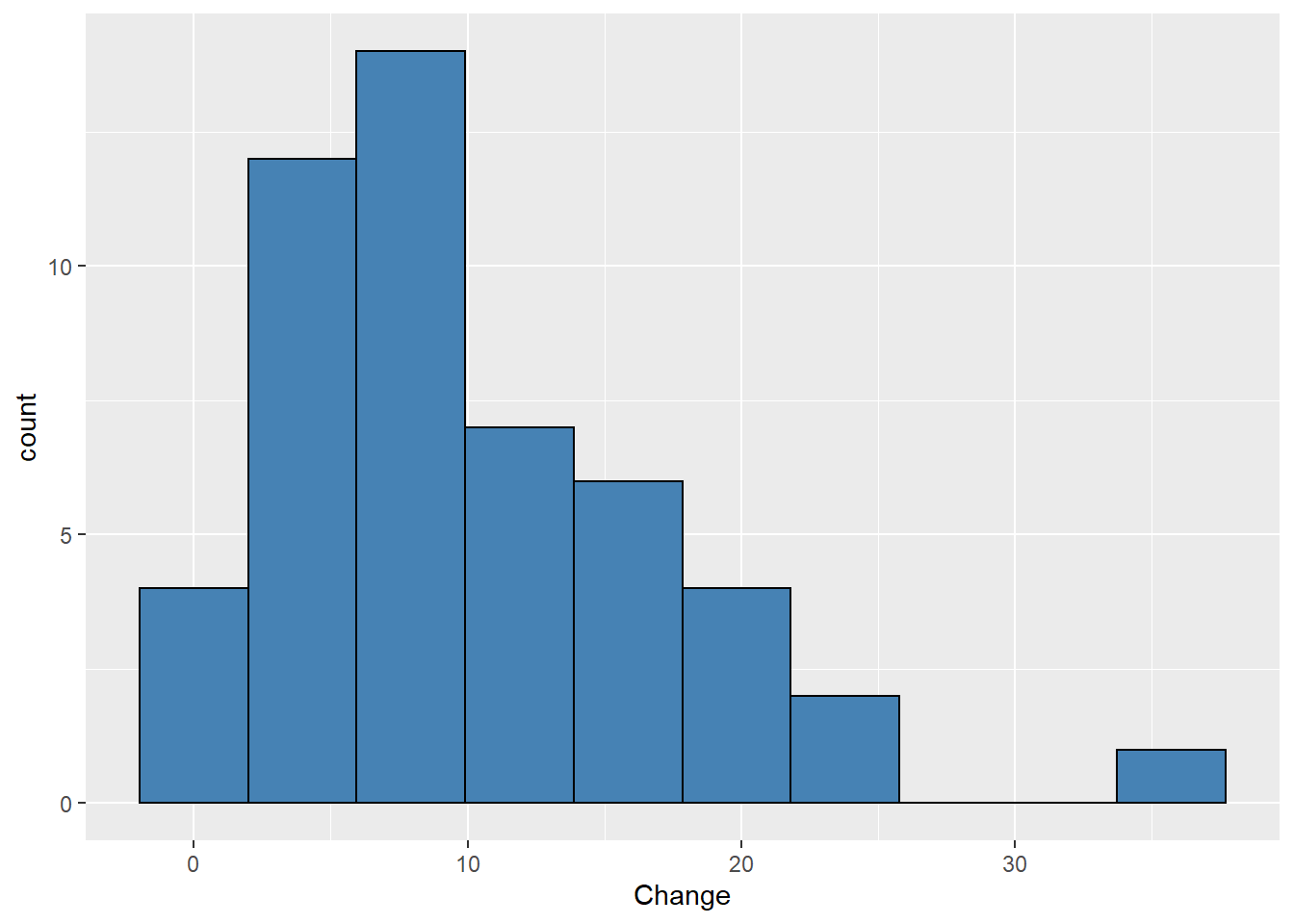

Correlation plot & Corelogram
Correlations are something we will need the majority of the time. They will help you to visualize the relationship between your variables. Yet, correlations are not the final answer to your hypothesis; many things in the natural world are correlated; therefore, you need to remember that correlation is not causation.
#install.packages("psych")
#if (!requireNamespace("devtools")) install.packages("devtools") # if new to R run this line too, you will be able to obtain some packages created by the community
#devtools::install_github("caijun/ggcorrplot2") #cor plot package
library(psych)
library(ggcorrplot2)
#get correlation test
correlation.test <- psych::corr.test(mtcars[,c(1,3,5:7)],use = "pairwise",method = "spearman")
my.correlation<-correlation.test$r # from the test get ($) the correlation values
p.values.correlation<-correlation.test$p # from the test get ($) the correlation p values

ggcorrplot.mixed(my.correlation, #values in a matrix format
                 upper = "circle", #the upper part use circles
                 lower = "number",  #the lower part with numbers
                 p.mat = p.values.correlation, # use the pvalues stored in p.values.correlation
                 insig = "label_sig",  #label the sig correlations
                 sig.lvl = c(0.05, 0.01, 0.001)) #it will use * so we set the levels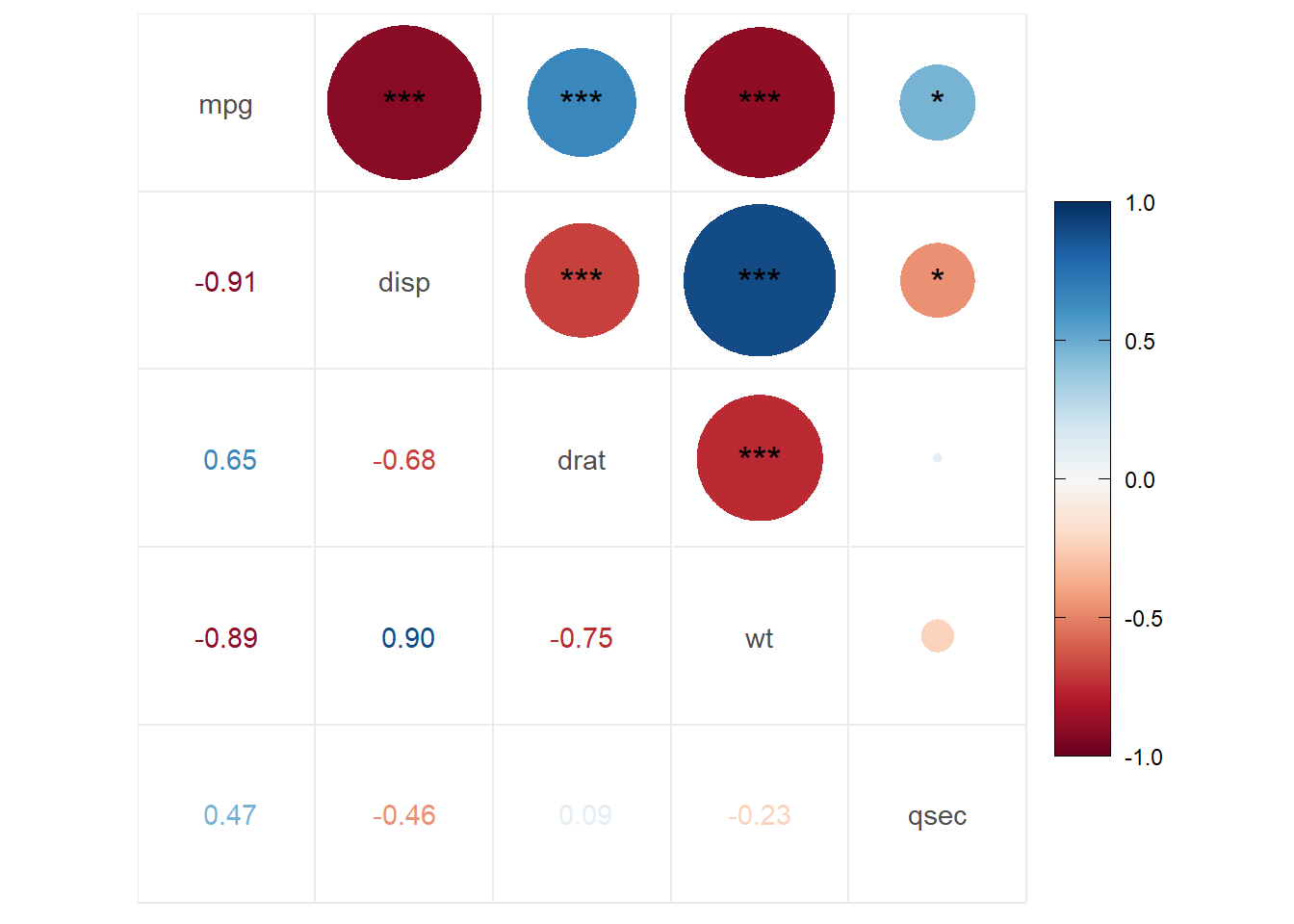
ggcorrplot(my.correlation,
                 method = "square",
                 type="lower",
                 p.mat = p.values.correlation,
                 insig = "pch", #use a cross for the non sig correlations
                  show.diag = F, #remove the diagonal correlations
                 sig.lvl = c(0.05))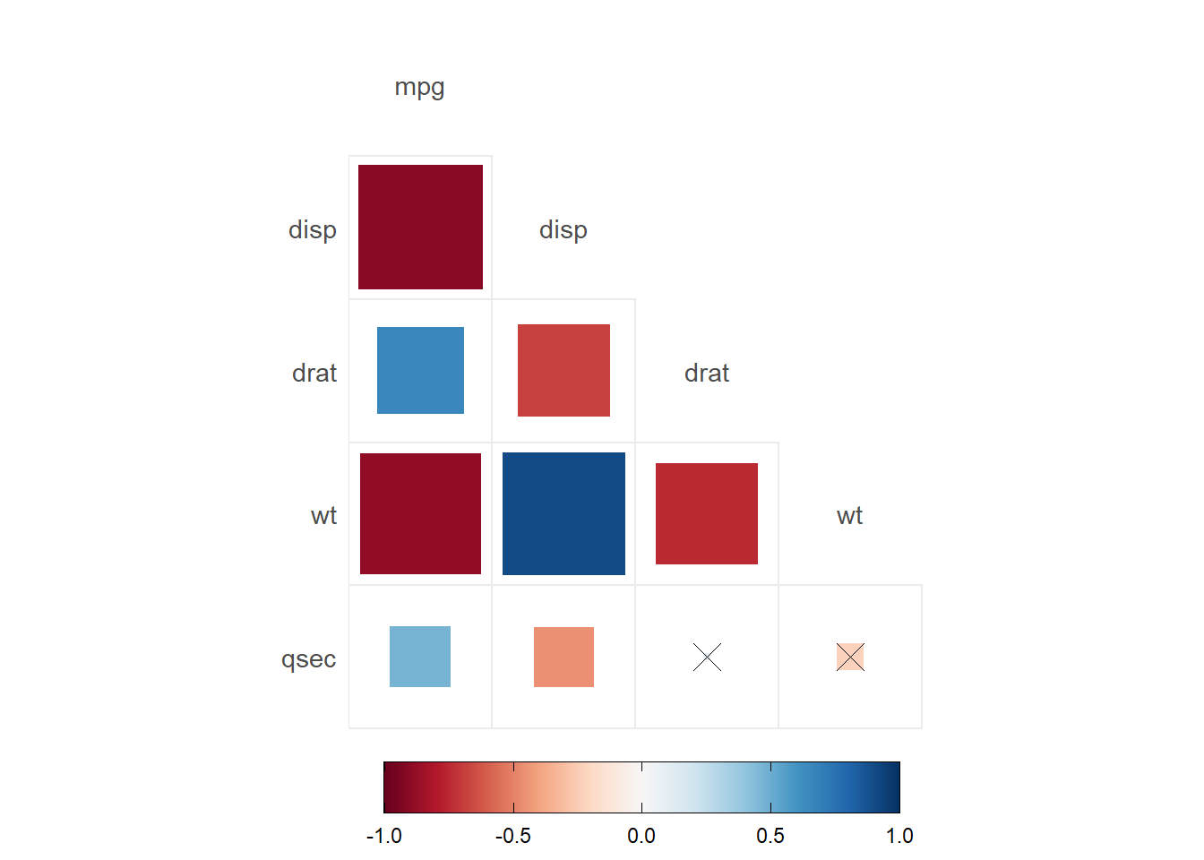
- Correlations are obtained by using
psych::corr.test(). Here you will have a correlation, and the p-value of each correlation - There are a few options for the correlation plots:
ggcorrplotorggcorrplot.mixed. - Here, we added
p.mat= p.values.correlationwhich has the correlation p-values to do different options. In the first, we set significant levels to draw asterisks in the correlations. In the second graph, we set the significant level of 0.05; any value bigger than 0.05 will be marked with an xpch. We can also remove the nonsignificant correlations by settinginsig="blank".