This week, we will cover data summaries, data structure, linear regression and its assumptions.
At the beginning of each session, we will need to load our libraries, so let’s load the packages for this week.
library(tidyverse)
library(plotrix)
library(ggpubr) #install.packages("ggpubr")
library(qqplotr) #install.packages("qqplotr")
library(PerformanceAnalytics)#install.packages("PerformanceAnalytics")
library(gcookbook)
library(tidyr) #install.packages("tidyr")
Sample Statistics and Summary results
Mean, variance, and error values are always required for the final report. It can take a while to sort the data in the right way, and several times you may want to check how your data looks frequently. Tydiverse is a complex group of packages that include ggplot2 and dplyr. Adding, changing, combining, removing is simple with dplyr.
data("storms")
head(storms) #look at the first 6 rows
## # A tibble: 6 x 13
##   name   year month   day  hour   lat  long status       category  wind pressure
##   <chr> <dbl> <dbl> <int> <dbl> <dbl> <dbl> <chr>        <ord>    <int>    <int>
## 1 Amy    1975     6    27     0  27.5 -79   tropical de~ -1          25     1013
## 2 Amy    1975     6    27     6  28.5 -79   tropical de~ -1          25     1013
## 3 Amy    1975     6    27    12  29.5 -79   tropical de~ -1          25     1013
## 4 Amy    1975     6    27    18  30.5 -79   tropical de~ -1          25     1013
## 5 Amy    1975     6    28     0  31.5 -78.8 tropical de~ -1          25     1012
## 6 Amy    1975     6    28     6  32.4 -78.7 tropical de~ -1          25     1012
## # ... with 2 more variables: ts_diameter <dbl>, hu_diameter <dbl>
mean(storms$wind) # mean wind speed of all the recored storms
## [1] 53.495sd(storms$pressure) # pressure standard deviation of all the recored storms
## [1] 19.51678plotrix::std.error(storms$ts_diameter) # standard error of storm eye diameter
## [1] 2.394685I am sure you are familiar with that as it is something we can get from any statistical program; now, let’s look at how to deal with more information and different results.
#library(tidyverse)
storms[,c(1,2,10,11)]%>% #dataset and variables we will work with [row,column] use c(for selecting multiple columns)
  dplyr::group_by(name,year)%>% #group by name and year
  dplyr::summarise_all(funs(mean(.,na.rm = T), #use funs( to get multiple estimators)
                           sd(.),
                           var(.), #sd^2
                           plotrix::std.error(.),
                           observations=length(.))) # we can name the variables directly  length tells you how many observations in each group
## # A tibble: 426 x 12
## # Groups:   name [198]
##    name      year wind_mean pressure_mean wind_sd pressure_sd wind_var pressure_var
##    <chr>    <dbl>     <dbl>         <dbl>   <dbl>       <dbl>    <dbl>        <dbl>
##  1 AL011993  1993      27.5         1000.    2.67       1.55      7.14        2.41
##  2 AL012000  2000      25           1009.    0          0.957     0           0.917
##  3 AL021992  1992      29           1007.    2.24       0.894     5           0.8
##  4 AL021994  1994      24.2         1016.    5.85       0.753    34.2         0.567
##  5 AL021999  1999      28.8         1005.    2.5        0.957     6.25        0.917
##  6 AL022000  2000      29.2         1009.    1.95       0.515     3.79        0.265
##  7 AL022001  2001      25           1011     0          0.707     0           0.5
##  8 AL022003  2003      30           1009.    0          0.957     0           0.917
##  9 AL022006  2006      38           1002.    5.70       4.04     32.5        16.3
## 10 AL031987  1987      21.2         1010.    8.71       2.44     75.8         5.97
## # ... with 416 more rows, and 4 more variables: wind_plotrix::std.error <dbl>,
## #   pressure_plotrix::std.error <dbl>, wind_observations <int>,
## # pressure_observations <int>- group_by is one of the best elements of dplyr; it works by making one data set for all the information you add in group_by(). Here, we group all the storms with the same name; if there are multiple elements, then we group them again by year. In the output, you will see there is
Groups: name [198]this means that there are 198 names, some with multiple years, so we get a data set with 426 rows. - summarise_all means that all the functions will be applied to all the variables excluded from
group_by. - na.rm and ‘.’: The
.means to use all the information; we want to do it for each variable.na.rm=Tmeans remove missing values if there are some TRUE (yes).
You want to know if there is a relationship between wind and pressure, so we need to visualize both variables in a scatter plot.
data("storms") #we will work with the dataset: Carbon Dioxide Uptake in Grass Plants
tail(storms,4) #show me the last 4 observations
## # A tibble: 4 x 13
##   name   year month   day  hour   lat  long status    category  wind pressure
##   <chr> <dbl> <dbl> <int> <dbl> <dbl> <dbl> <chr>     <ord>    <int>    <int>
## 1 Kate   2015    11    11     0  33.1 -71.3 hurricane 1           65      990
## 2 Kate   2015    11    11     6  35.2 -67.6 hurricane 1           70      985
## 3 Kate   2015    11    11    12  36.2 -62.5 hurricane 1           75      980
## 4 Kate   2015    11    11    18  37.6 -58.2 hurricane 1           65      980
## # ... with 2 more variables: ts_diameter <dbl>, hu_diameter <dbl>
# we will begin by plotting the variables of our hypothesis
ggplot(storms,mapping = aes(x=wind,y=pressure))+
geom_point()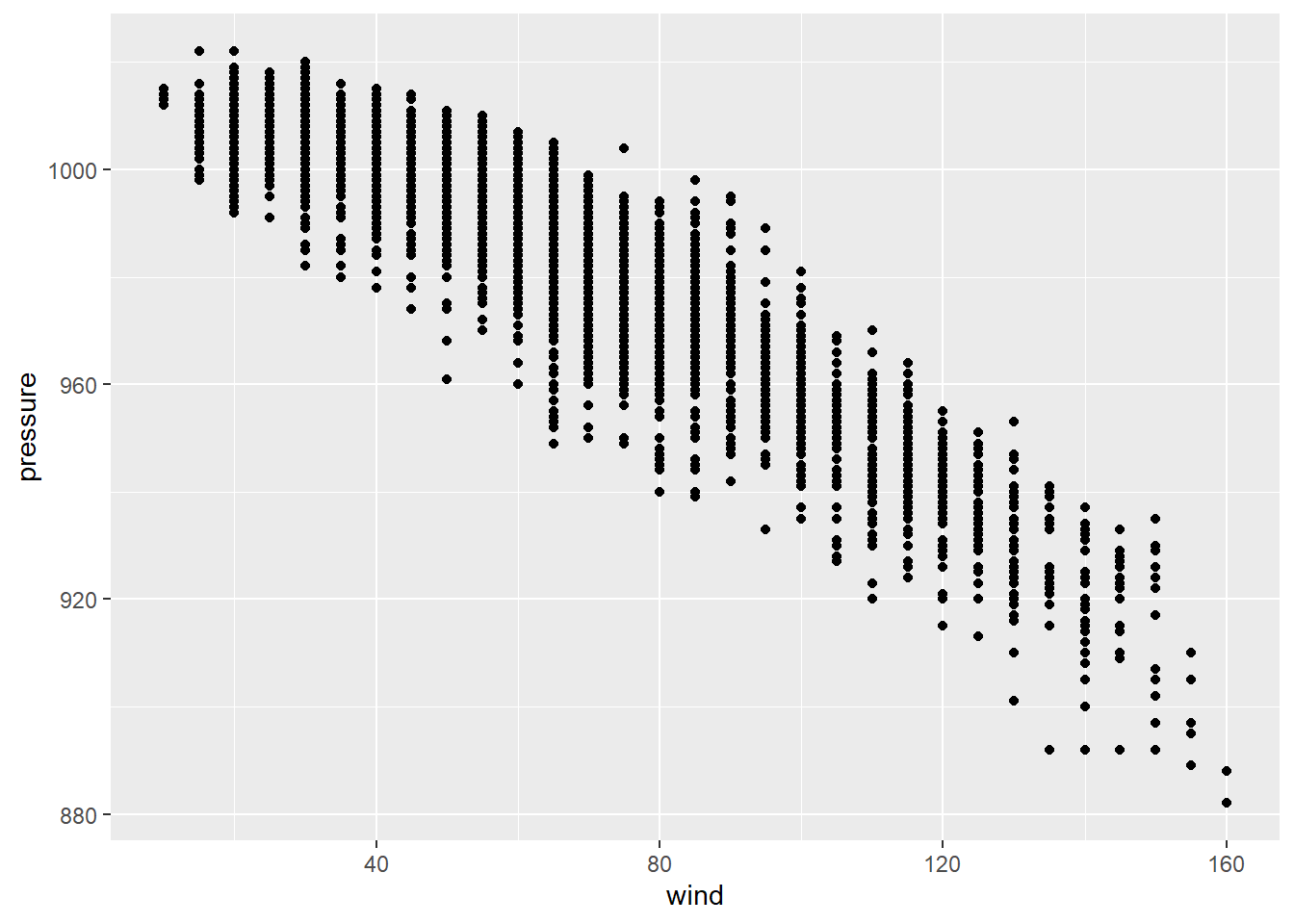
It looks like there is some sort of relationship, a negative relationship, between our variables of interest. However, we need statistical models to determine the changes in pressure with wind and how significant are those changes.
Least squares Linear Regression:
The least-squares method, also defined as the line of best fit, aims to produce a model that reduces the variation or error between the expected and predicted values. Next, we will run a simple linear regression with lm with our two variables to understand this concept and estimate model parameters which are often called ordinary least squares estimates. The previous scatter looked roughly linear, so let’s examine their relationship.
fit.lm<-lm(pressure~wind, data = storms) # y~x makes sure to use this `~`
fit.lm #information inside fit.lm
##
## Call:
## lm(formula = pressure ~ wind, data = storms)
##
## Coefficients:
## (Intercept)         wind
##   1029.6670      -0.7015
Equation for the LSLR: 1029.66 - 0.7015x
We can also add the error term by using sigma.
sigma(fit.lm) # residual standard deviation E
## [1] 6.536737
confint(fit.lm) # get confidence intervals for all the terms
## 2.5 % 97.5 %
## (Intercept) 1029.3759591 1029.9580714
## wind -0.7064102 -0.6966387Therefore, the equation for the LSLR with a CI of 95% confidence level will be 1029.66 - 0.7015x \(\pm\) 6.537.
Confidence Intervals (CI)
They are values that also represent the accuracy of our sample mean. This will show a range of plausible values not only for the mean but for any unknown parameter.
labels<-data.frame(label=c("99%","95%","90%","90%","95%","99%"),
          x=c(-2.326348,-1.644854,-1.281552,1.281552,1.644854,2.326348),
          y=c(0.03,0.105,0.18,0.18,0.105,0.03))
ggplot(data.frame(x = c(-4, 4)), aes(x = x)) +
  stat_function(fun = dnorm,
    geom = "area",fill = "grey10",alpha = .3) +
  geom_vline(xintercept=0,colour="black",linetype="dotted")+
  stat_function(fun = dnorm,
    geom = "area",fill = "steelblue",
    xlim = c(-qnorm(.90), -4))+
  stat_function(fun = dnorm,geom = "area",fill = "steelblue",xlim = c(qnorm(.90), 4))+
  stat_function(fun = dnorm,geom = "area",fill = "tomato",xlim = c(qnorm(.95), 4))+
  stat_function(fun = dnorm,geom = "area",fill = "tomato",xlim = c(-qnorm(.95), -4))+
  stat_function(fun = dnorm,geom = "area",fill = "forestgreen",xlim = c(qnorm(.99), 4))+
  stat_function(fun = dnorm,geom = "area",fill = "forestgreen",xlim = c(-qnorm(.99), -4))+
  ggrepel::geom_text_repel(data=labels,mapping = aes(x=x,y=y,label=label),nudge_y = 0.1)+
  annotate("text",x=-3.5,y=0.3,label=paste0("N(","\u03BC",",","\u03C3","\u00B2", ")"),size=6,fontface = 'italic')+
  labs(title = "Normal Distribution",x ="",y = "f(x)") +
  scale_x_continuous(breaks = c(-2.326348,-1.644854,-1.281552,0,1.281552,1.644854,2.326348),
                     labels = c(paste0("\u03BC",c(-3,-2,-1),"\u03C3"),"\u03BC",paste0("\u03BC","\u002B",c(1,2,3),"\u03C3")))+
  scale_y_continuous(expand = c(0.0,0.0))+ # no space at the top/bottom
  theme_bw()+
  theme(panel.grid = element_blank(), # remove grid lines
        axis.text.x = element_text(colour="black"), # text of x axis black
        axis.text.y =element_blank(), #remove the labels of y axis
        axis.ticks.y = element_blank()) #remove the ticks on y axis only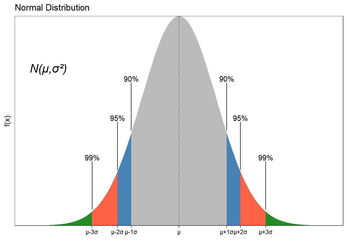
As we increase our confidence interval, we are more likely to include the true value of the parameter.
Coefficient of determination
In our regression model, the coefficient of determination is calculated by diving the quotient of the variances of the dependent variable’s fitted and observed values. This tells us how much of the variation of y is explain by the model or how well the model fits the data. It would help to look at the adjusted R-square when fitting a multiple regression because it deals with any noise created by adding more variables.
results=base::summary(fit.lm) #save all the summary in a large summary
results$r.squared #take the coefficient of determination
## [1] 0.8878337
The model explains 88.78% of the variation in pressure.
Simple Linear Regression
The regression model was done, and we needed to know how significant those results were. However, before we begin, you must check the data before regression and any other model that you run. By this, it is meant that we should determine something like the normality of the data. There are multiple tests, and if not normally distributed, we will need to transform the data.
Assumption One (Normality)
Use shapiro.test to carry out the normality test; here, the H0 means normally distributed data. P-Values >0.05 will support this normal distribution of your variable.
#library(gcookbook) #data set
library(gcookbook)
data("heightweight")
shapiro.test(heightweight$heightIn) # normality test passed
##
##  Shapiro-Wilk normality test
##
## data:  heightweight$heightIn
## W = 0.99628, p-value = 0.849
# normality test failed
shapiro.test(iris$Sepal.Length)
##
## Shapiro-Wilk normality test
##
## data: iris$Sepal.Length
## W = 0.97609, p-value = 0.01018# normality test with transformed data passed
shapiro.test(log(iris$Sepal.Length))
##
## Shapiro-Wilk normality test
##
## data: log(iris$Sepal.Length)
## W = 0.98253, p-value = 0.05388Clearly, we can make more sense of the data when we plot it. Plotting will be helpful when you have many variables and want to have a quick look at the data.
# not transformed data
ggplot(data=iris,mapping = aes(sample=Sepal.Length))+
  geom_qq()+
  geom_qq_line()+
  theme_bw()
#plot with transformed data and an alternative package to ggplot2
ggpubr::ggqqplot(log(iris$Sepal.Length)) # set the variable that you want to get the qqplot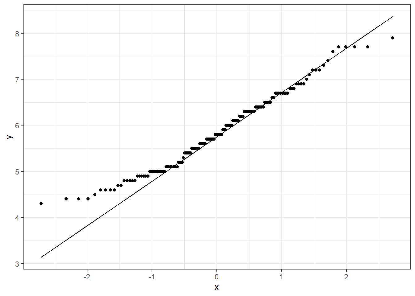
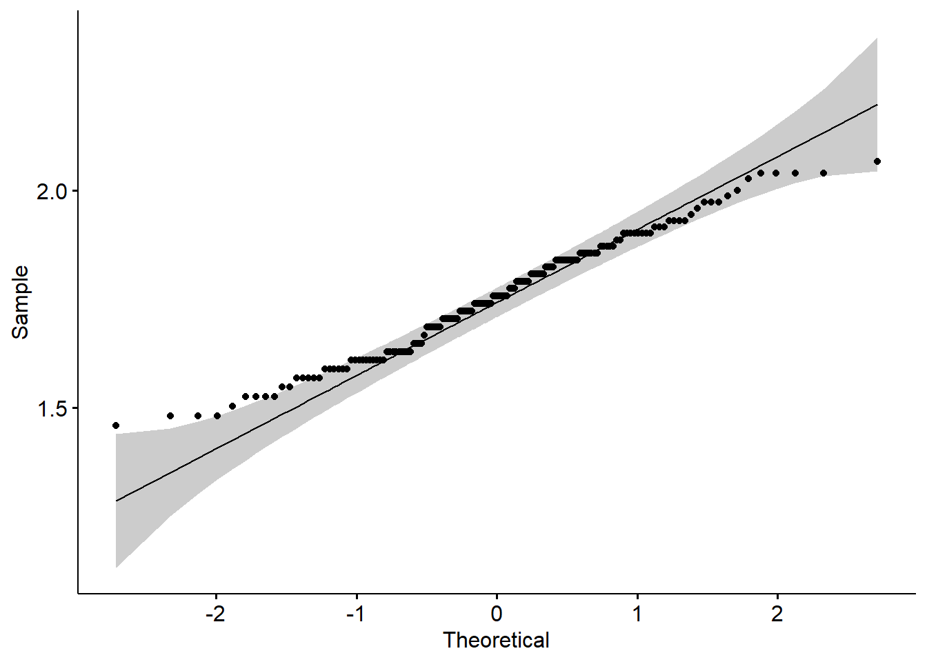
Data transformation resulted in a better qq-plot. Now we can see why it passed the
shapiro.test.We used two options, one plot with the normal ggplot2 and the second one with the package
ggpubr. The last is a package that reduces ggplot2 lines of code and gives you great results. It is a great option if you work with small data sets and want to have good graphs. We will cover more about this package in a few weeks.
Let’s build a data set for our regressions and model:
#library(qqplotr)
set.seed(15)
df<-data.frame(temperature=rnorm(100,mean = 25,sd=8),
               wind=rnorm(100,mean = 10,sd=1.2),
               radiation=rnorm(100,mean = 5000,sd=1000),
               bacterias=rnorm(100,mean = 50,sd=24.22),
               groups=c("Day","Night"))
head(df,6)
##   temperature      wind radiation bacterias groups
## 1    27.07058  9.951969  5818.690  55.49904    Day
## 2    39.64897  9.964412  4938.840  29.82846  Night
## 3    22.28305  8.550304  5527.404  38.30339    Day
## 4    32.17759 11.758406  4995.665  60.15574  Night
## 5    28.90413 11.294930  5228.475  42.19714    Day
## 6    14.95691  9.598272  3894.247  85.30897  Night
shapiro.test(df$radiation) # normal distribution
##
## Shapiro-Wilk normality test
##
## data: df$radiation
## W = 0.96947, p-value = 0.02012
shapiro.test(df$wind) # normal distribution
##
## Shapiro-Wilk normality test
##
## data: df$wind
## W = 0.97584, p-value = 0.06274
shapiro.test(df$temperature) #normal distribution
##
## Shapiro-Wilk normality test
##
## data: df$temperature
## W = 0.992, p-value = 0.8216Assumption two (Linearity)
The relationship between the independent and dependent variables must be linear. A scatter plot is our alternative to test if there is a linear distribution that would show our points is something like a straight line.
ggplot(df,mapping = aes(x=temperature,y=bacterias))+
  geom_point()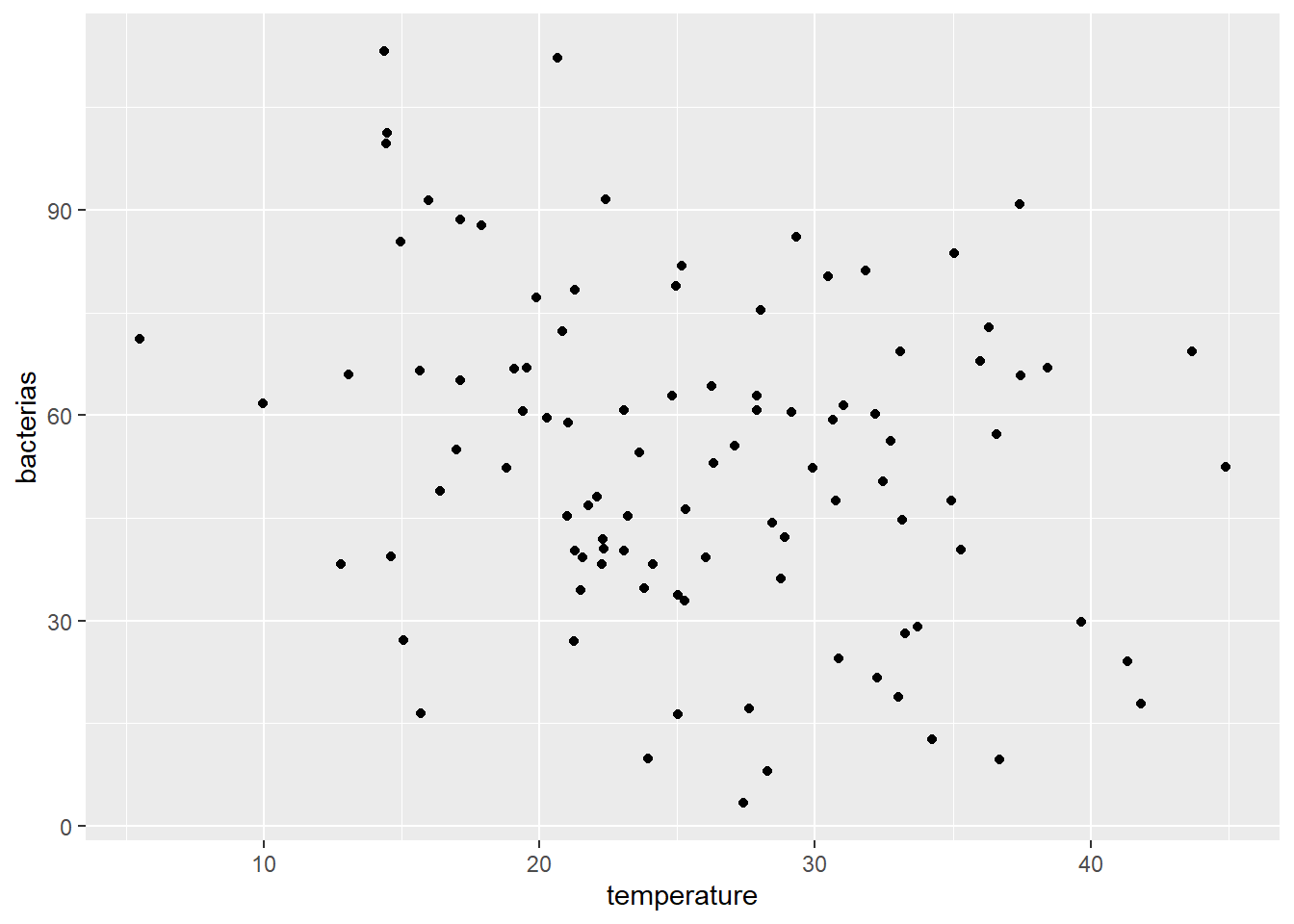
There is no apparent linearity, but you can see that data is showing a slightly decreasing trend.
Now that all the variables are normally distributed and there is a linear relationship, we can use them in our regression.
Null hypothesis (H0): There is no change in bacteria population with temperature, radiation, etc.
Alternative hypothesis (H1): Bacteria population changes with temperature, radiation, etc.
fit.lm<- lm(bacterias~temperature,data=df)
summary(fit.lm)
##
## Call:
## lm(formula = bacterias ~ temperature, data = df)
##
## Residuals:
##     Min      1Q  Median      3Q     Max
## -49.153 -16.873   1.069  16.100  54.899
##
## Coefficients:
##             Estimate Std. Error t value Pr(>|t|)
## (Intercept)  72.4498     7.9532   9.110 1.04e-14 ***
## temperature  -0.7300     0.2945  -2.478   0.0149 *
## ---
## Signif. codes:  0 '***' 0.001 '**' 0.01 '*' 0.05 '.' 0.1 ' ' 1
##
## Residual standard error: 23.3 on 98 degrees of freedom
## Multiple R-squared:  0.05898,    Adjusted R-squared:  0.04938
## F-statistic: 6.142 on 1 and 98 DF,  p-value: 0.01491
Breakdown of the elements of the results summary:
The estimates
(Estimate)is the change in y caused by each element of the regression. (Intercept) or the value of the y-intercept (in this case 60.7266) is the calculated value of y when x is 0.temperature or any x variable values in theEstimatecolumn show changes in y (e.g., the population of bacteria) with one unit increase inx`. Therefore, for the temperature group, we could say that the bacteria population gets reduced by -0.22 units for each increment in temperature if Pr(>|t|) < 0.05. Here it is not the case, so we can not reach that conclusion.The standard error of the estimated values are in the second column
Std. Error.The test statistic showed under
t value.The p-value
Pr(>| t | ), the probability of finding the given t-statistic by chance, and therefore, the calculatedestimatefor that variable.
We can see that the bacteria population did not change with temperature (P-value>0.05). Let’s see how radiation affects our bacteria population.
fit.lm<- lm(bacterias~radiation,data=df)
summary(fit.lm)
##
## Call:
## lm(formula = bacterias ~ radiation, data = df)
##
## Residuals:
## Min 1Q Median 3Q Max
## -48.910 -17.761 -0.201 13.905 58.504
##
## Coefficients:
## Estimate Std. Error t value Pr(>|t|)
## (Intercept) 64.030405 11.503156 5.566 2.27e-07 ***
## radiation -0.002119 0.002287 -0.927 0.356
## ---
## Signif. codes: 0 '***' 0.001 '**' 0.01 '*' 0.05 '.' 0.1 ' ' 1
##
## Residual standard error: 23.92 on 98 degrees of freedom
## Multiple R-squared: 0.008686, Adjusted R-squared: -0.001429
## F-statistic: 0.8587 on 1 and 98 DF, p-value: 0.3564We got similar results, so we would conclude that we are 95% confident that radiation and temperature alone do not affect the population of bacteria. 95% confident because we run our model at this CI.
Model test assumption (Homoscedasticity)
We should ensure that the model fitted meets this last assumption, the same variance over the prediction range, to maintain the model. This means that the error term needs to be the same across all values of the independent variables. The fitted model already has all the information we need for the plots, so we will just call plot(model).
par(mfrow=c(2,2)) #plot panel to fit 2 by 2 pictures
plot(fit.lm) # lm result has 4 figures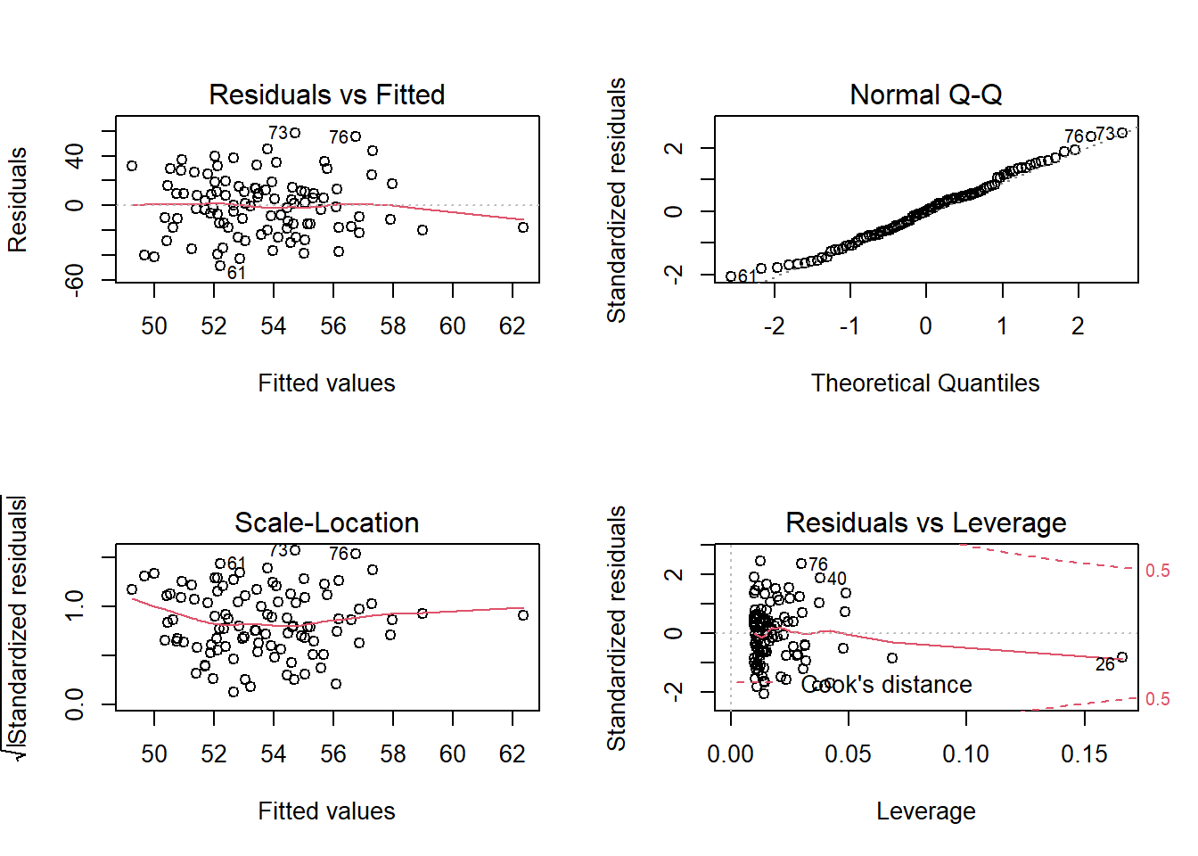
par(mfrow=c(1,1)) #we set them back to normalHere we can see that the residual errors are constant across the groups and distributed evenly. Look at the Normal Q-Q (top right), which under homoscedasticity it should show the points along the line.
- This will conclude a simple linear regression model and its analysis.
Extra Notes
- When we get many variables, we can do the test in one line of code with lappy. Additionally, when you run multiple variables, the resulting object is a list (results of the first, results of the second, results of the n). We can’t access the list like a data frame; it needs list[[i]] to observe, export, use all those values in other parts of your documents. We need to unlist, bind rows (
rbind), and save them in adata.frame.
Run the same test for each variable
results<-data.frame(
  do.call(rbind,
          lapply(df[,1:3],function(x) shapiro.test(x)[c("statistic","p.value")])))
results # how the data looks like
##             statistic    p.value
## temperature 0.9920047  0.8215678
## wind        0.9758363 0.06274086
## radiation    0.969466 0.02012186
Let’s take each element and extract just what we need.
results$statistic<-unlist(results$statistic) # remove any text left,the list structure and make it a new vector
results$p.value<-unlist(results$p.value) #remove the list structure and make it a new vector
str(results) # data frame with two numeric variables
## 'data.frame':    3 obs. of  2 variables:
##  $ statistic: num  0.992 0.976 0.969
##  $ p.value  : num  0.8216 0.0627 0.0201
Most of the time there are multiple options so you can also do something like this too:
#option 2
allshapiro.tes<-lapply(df[,1:3],shapiro.test) #as a list apply the function shapiro.test to the variables [,1:3] in the data frame df
#allshapiro.tes # how the data looks like for all the variables
results<-data.frame(t(sapply(allshapiro.tes,`[`,c("statistic","p.value")))) #let's take what we really need
results$statistic<-unlist(results$statistic) # remove any text left,the list structure and make it a new vector
results$p.value<-unlist(results$p.value) #remove the list structure and make it a new vector
str(results)
## 'data.frame': 3 obs. of 2 variables:
## $ statistic: num 0.992 0.976 0.969
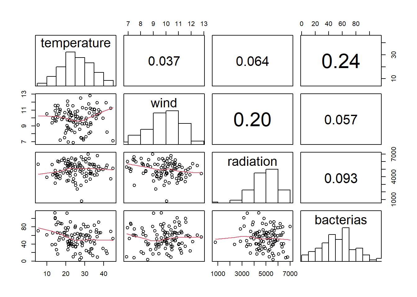
## $ p.value : num 0.8216 0.0627 0.0201Correlations, histograms, and scatters plot modifications
Here, there is a function to get correlations, scatter plots, and histograms with text over the bins.
panel.cor <- function(x, y, digits = 2, prefix = "", cex.cor, ...) {
  usr <- par("usr")
  on.exit(par(usr))
  par(usr = c(0, 1, 0, 1))
  r <- abs(cor(x, y, use = "complete.obs",method = "pearson"))
  txt <- format(c(r, 0.123456789), digits = digits)[1]
  txt <- paste(prefix, txt, sep = "")
  if (missing(cex.cor)) cex.cor <- 0.8/strwidth(txt)
  text(0.5, 0.5, txt, cex =  cex.cor * (1 + r) / 2)
}

panel.hist <- function(x, ...) {
  usr <- par("usr")
  on.exit(par(usr))
  par(usr = c(usr[1:2], 0, 1.5) )
  h <- hist(x, plot = FALSE)
  breaks <- h$breaks
  nB <- length(breaks)
  y <- h$counts
  y <- y/max(y)
  rect(breaks[-nB], 0, breaks[-1], y, col = "white", ...)
}

df %>% # your data frame
  dplyr::select(-groups) %>% #remove categorical variables names or numbers if multiple -c()
  pairs(
    upper.panel = panel.cor,
    diag.panel  = panel.hist,
    lower.panel = panel.smooth
  )
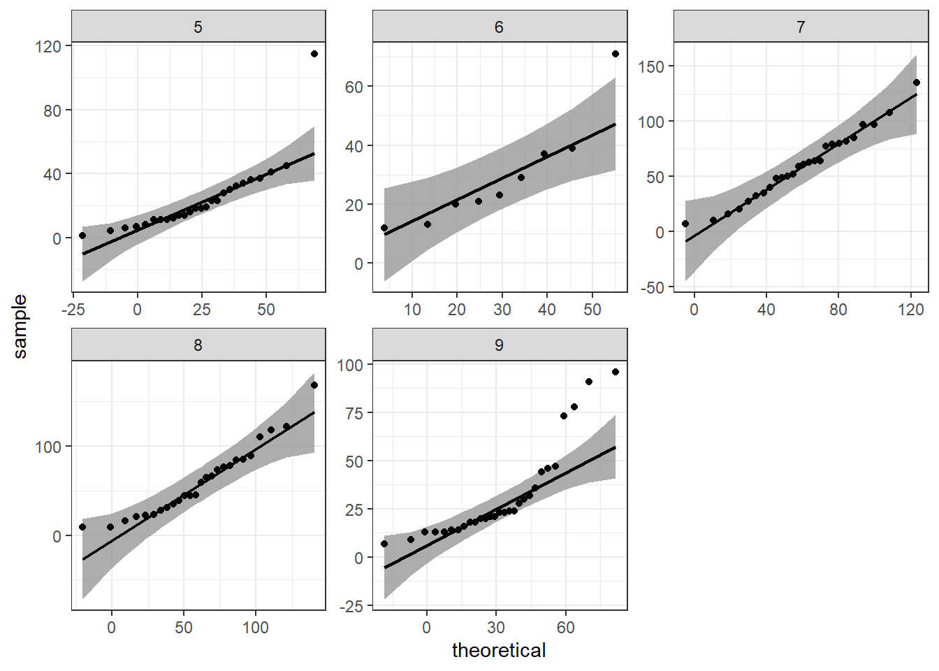
Alternative qqplots
ggpurb adds a confidence region with the qqplot, we can do that with ggplot2 and the package qqplotr
library(qqplotr) #install.packages("qqplotr")
ggplot(data=airquality,mapping = aes(sample=Ozone))+
  geom_qq()+
  geom_qq_line()+
  facet_wrap(.~Month,scales = "free")+
  theme_bw()
ggplot(data=airquality,mapping = aes(sample=Ozone))+
  #geom_qq()+
  stat_qq_band()+
  stat_qq_line()+
  stat_qq_point()+
  facet_wrap(.~Month,scales = "free")+
  theme_bw()
#values should be inside that grey shadow 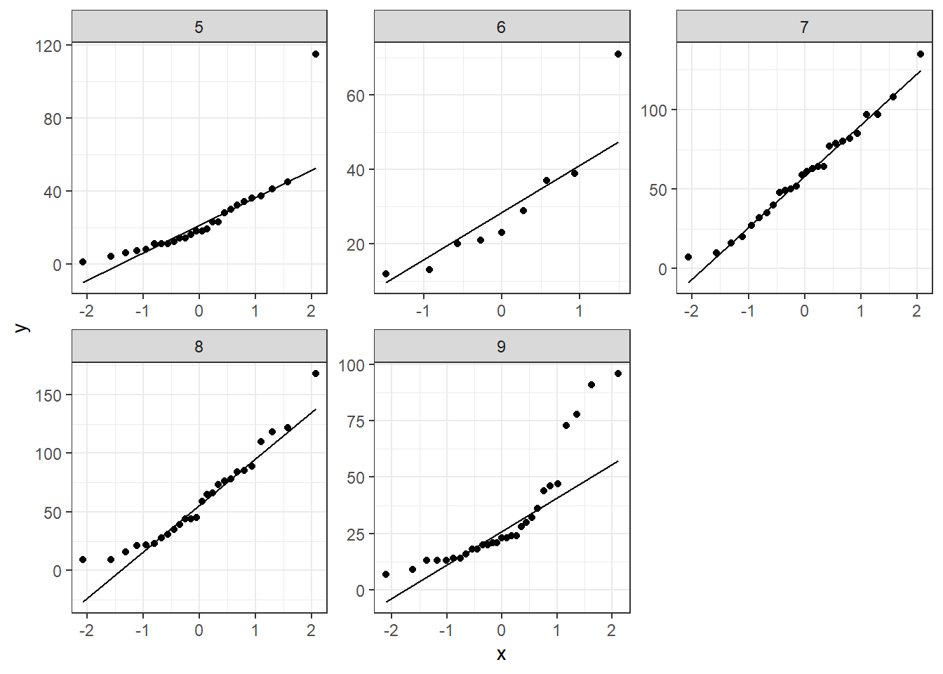
Rearrange multiple variables for ggplot2
To use ggplot2 at a more advanced level, you need to set a long data format. This means that all your response variables need to be in rows and any grouping in a different variable.
Let’s use the iris dataset once again.
head(iris)
##   Sepal.Length Sepal.Width Petal.Length Petal.Width Species
## 1          5.1         3.5          1.4         0.2  setosa
## 2          4.9         3.0          1.4         0.2  setosa
## 3          4.7         3.2          1.3         0.2  setosa
## 4          4.6         3.1          1.5         0.2  setosa
## 5          5.0         3.6          1.4         0.2  setosa
## 6          5.4         3.9          1.7         0.4  setosa
iris.long<-tidyr::gather(data=iris,key="Response_variable",value="observation_value",1:4) #the numbers represent the columns that you want to make rows.
# lets bring the code from the first graph and change the variables and the data set
ggplot(data=iris.long,mapping = aes(sample=observation_value))+
  geom_qq()+
  geom_qq_line()+
  facet_grid(Response_variable~Species,scales = "free")+ #y~x
  theme_bw()

# we got two options for the facets grid and wrap so let's try facet_wrap to see the differences
ggplot(data=iris.long,mapping = aes(sample=observation_value))+
  geom_qq()+
  geom_qq_line()+
  facet_wrap(Response_variable~Species,scales = "free")+ #y~x
  theme_bw()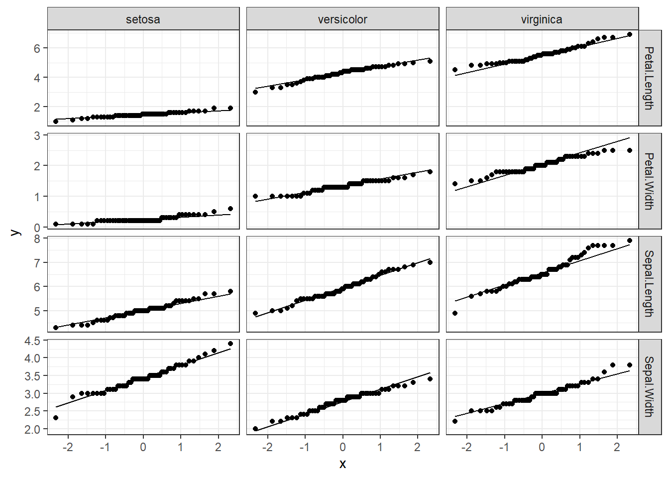
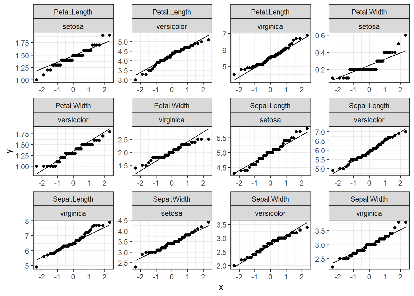
That is a great and fast way to see distributions, and you can create many plots at once.