👩 This week, we will use the following packages as always, load them at the beginning of the session 👨
library(tidyverse)
library(ggpmisc)
library(DMwR)
#install.packages("package_name") #if you dont have one of them
Interpreting Coefficients
Rate of Change
The simplest or the most basic explanation of the coefficient n:
A regression coefficient can be interpreted as the change in the expected response given a change in the corresponding term by one unit, assuming that other terms are held fixed.
However, with polynomial equations, the plot of the fitted curve is likely to be more informative than the values of the parameters.
Reparameterization
Sometimes, we need to consider replacing terms with linear or nonlinear transformations. In general, to make new variables, you can use the function mutate from the dplyr package.
data("airquality")
airquality<-mutate(airquality,A=Wind/Ozone,B=Solar.R*Wind)
lm(Temp~Wind+Solar.R,airquality)
##
## Call:
## lm(formula = Temp ~ Wind + Solar.R, data = airquality)
##
## Coefficients:
## (Intercept)         Wind      Solar.R
##     84.8997      -1.1557       0.0257
lm(Temp~A+B,airquality)
##
## Call:
## lm(formula = Temp ~ A + B, data = airquality)
##
## Coefficients:
## (Intercept)            A            B
##   81.855405    -4.522088    -0.000794
lm(Temp~Solar.R+B,airquality)
##
## Call:
## lm(formula = Temp ~ Solar.R + B, data = airquality)
##
## Coefficients:
## (Intercept)      Solar.R            B
##   72.173521     0.083718    -0.005224
Standardization of Terms
Terms usually come with different units, to get the relative importance, do rescaling:
#install.packages("DMwR") #install the ReScaling function
library(DMwR)
scaled_data<-data.frame(
                    sapply(airquality[,c(1:4,7,8)], #variables output in vector or matrix
                           ReScaling, #function
                           t.mx=50,t.mn=1)) #required arguments for the function
a=data.frame(do.call(cbind,
                   lapply(airquality, #variables output in list
                          ReScaling, #function
                          t.mx=50,t.mn=1))) #required arguments for the function
It is more informative than the untransformed coefficients. But still may miss leading, e.g., sampling over a small range versus a large range for the same population.
Sampling Distributions
The coefficients are useful, and we can understand the data ONLY IF the samples were taken randomly. In certain conditions, we can assume the samples to be random samples and then explain the regression coefficients and making statistical inferences. But a lot of times, we can not do this.
2D-Added variable plots
The Added Variable Plot helps us to visualize the effect of each term in the model. They evaluate the predictor variables’ residuals (and coefficients) holding other variables constant, a visual assessment of the net effect.
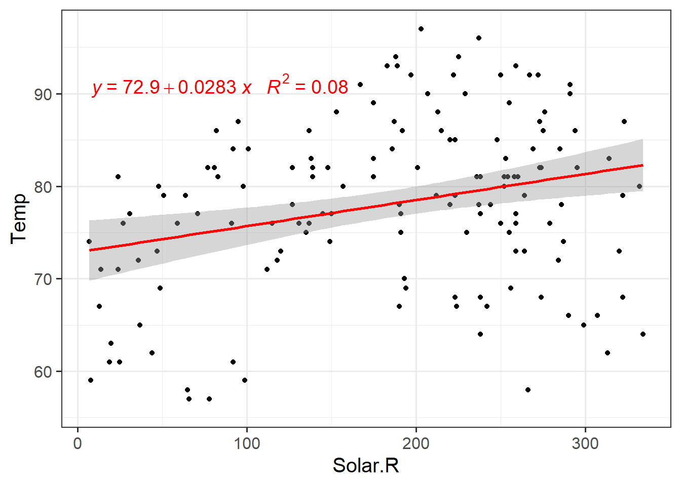
First, let’s look at the individual regression.
my.formula <- y ~ x
ggplot(airquality,aes(y=Temp,x=Wind))+
  geom_point()+
  geom_smooth(method = lm)+
  geom_smooth(method = 'loess',colour="red",se = F)+
  ggpmisc::stat_poly_eq(formula = my.formula,
                aes(label = paste(..eq.label.., ..rr.label.., sep = "~~~")),
                parse = TRUE,colour="Blue",label.y = 0.12,size=5)+
  theme(text = element_text(size=13))

ggplot(airquality,aes(y=Temp,x=Solar.R))+
  geom_point()+
  geom_smooth(method = lm,colour="red")+
    ggpmisc::stat_poly_eq(formula = my.formula,
                aes(label = paste(..eq.label.., ..rr.label.., sep = "~~~")),
                parse = TRUE,colour="red",label.y = 0.85,size=5)+
  theme_bw(base_size = 15)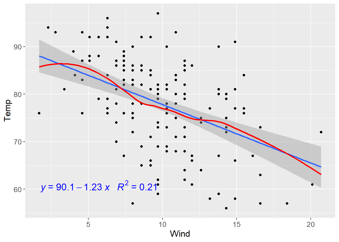
Now we will fit a multiple linear regression and explore the variable that has the most significant impact on temperature.
fit.lm<-lm(Temp~Wind+Solar.R+Ozone,airquality)
summary(fit.lm)
##
## Call:
## lm(formula = Temp ~ Wind + Solar.R + Ozone, data = airquality)
##
## Residuals:
##     Min      1Q  Median      3Q     Max
## -20.942  -4.996   1.283   4.434  13.168
##
## Coefficients:
##              Estimate Std. Error t value Pr(>|t|)
## (Intercept) 72.418579   3.215525  22.522  < 2e-16 ***
## Wind        -0.322945   0.233264  -1.384    0.169
## Solar.R      0.007276   0.007678   0.948    0.345
## Ozone        0.171966   0.026390   6.516 2.42e-09 ***
## ---
## Signif. codes:  0 '***' 0.001 '**' 0.01 '*' 0.05 '.' 0.1 ' ' 1
##
## Residual standard error: 6.834 on 107 degrees of freedom
##   (42 observations deleted due to missingness)
## Multiple R-squared:  0.4999, Adjusted R-squared:  0.4858
## F-statistic: 35.65 on 3 and 107 DF,  p-value: 4.729e-16
It looks like Ozone has an impact on temperature. Let’s get our 2D-AVP with the help of the car package.
#install.packages("car")
library(car)
avPlots(fit.lm)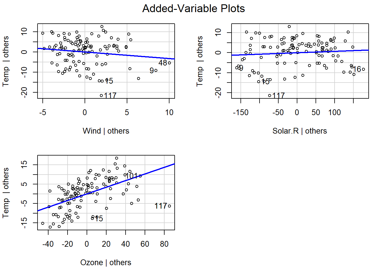
Here we can also observe that Ozone has the greatest impact on temperature. A few observations like 117 show some influence on the data and may need to be taken into further consideration.
Three extreme AVP cases:
Points on a Diagonal Line:
points=data.frame(x=seq(-2.5,2.5,.2),
                  y=seq(-2.5,2.5,.2))
ggplot(points,aes(x,y))+
  geom_point(shape=15,colour="red")+
  labs(x=bquote("\u00EA ("~u[2]~"|"~u[1]*")"),
       y=bquote("\u00EA ("~y~"|"~u[1]*")"))+
  ggplot2::annotate("text",x =(-1),y=2,
           label=bquote("\u00EA("~y~"|"~u[1]*") = \u00EA("~u[2]~"|"~u[1]*")"),
           size=10,colour="steelblue")+
  theme_bw(base_size = 15)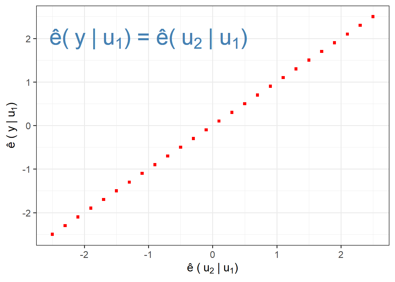
Points on Horizontal Line:
points=data.frame(x=seq(-2.5,2.5,.2),
                  y=0)
ggplot(points,aes(x,y))+
  geom_point(shape=1,colour="forestgreen",size=6)+
  labs(x=bquote("\u00EA ("~u[2]~"|"~u[1]~")"),
       y=bquote("\u00EA ("~y~"|"~u[1]~")"))+
  scale_y_continuous(limits = c(-2,2))+
  annotate("text",x = -1,y=0.5,label=bquote("\u00EA("~y~"|"~u[1]~") = 0"),size=10,colour="steelblue")+
  theme_bw(base_size = 15)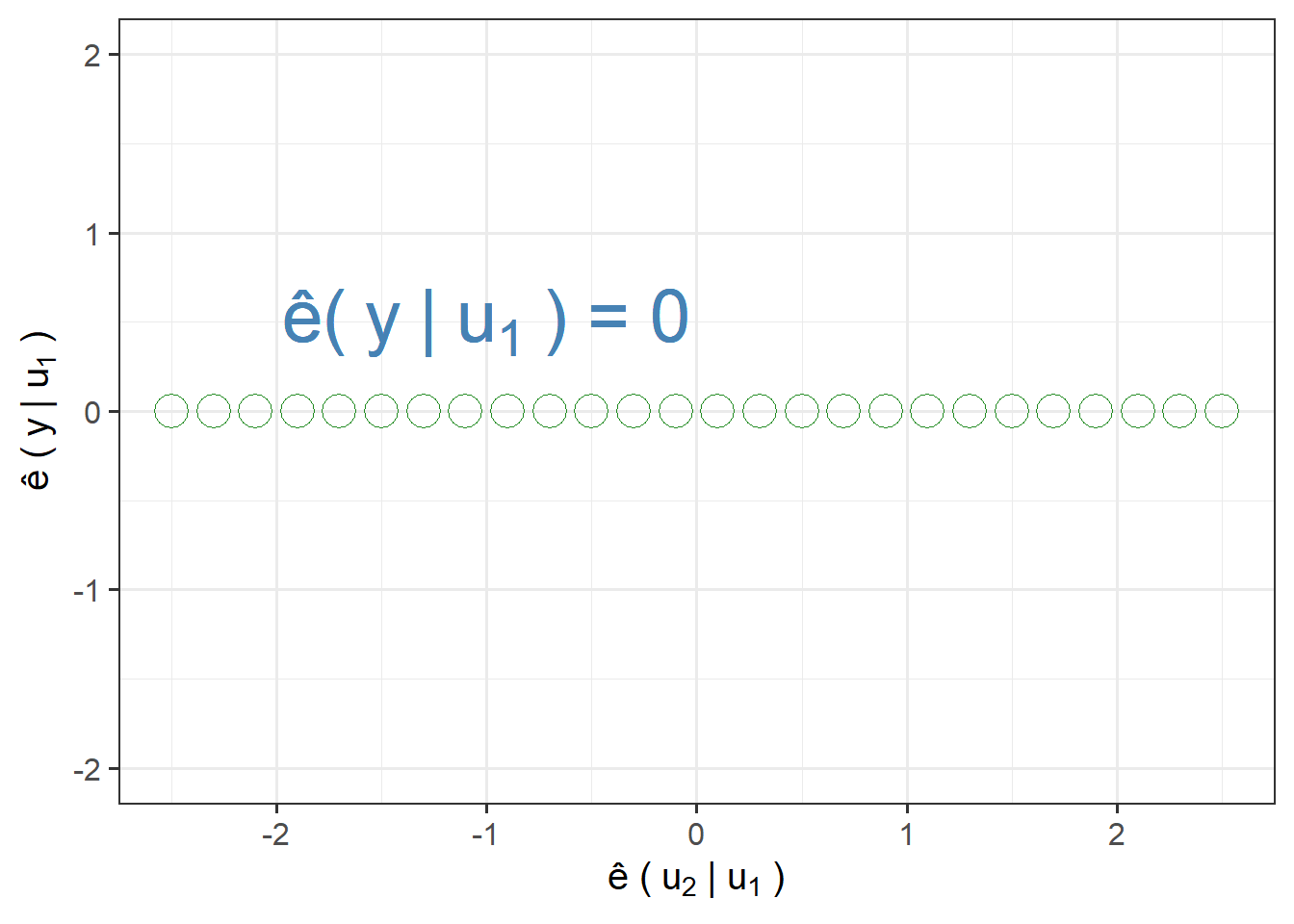
Points on a Vertical Line:
points=data.frame(x=0,
                  y=seq(-2.5,2.5,.2))
ggplot(points,aes(x,y))+
  geom_point(shape=6,colour="blue",size=3)+
  labs(x=bquote("\u00EA ("~u[2]~"|"~u[1]~")"),
       y=bquote("\u00EA ("~y~"|"~u[1]~")"))+
  scale_x_continuous(limits = c(-2,2))+
  annotate("text",x = -1,y=2,label=bquote("\u00EA("~u[2]~"|"~u[1]~") = 0"),size=10,colour="navy")+
  theme_bw(base_size = 15)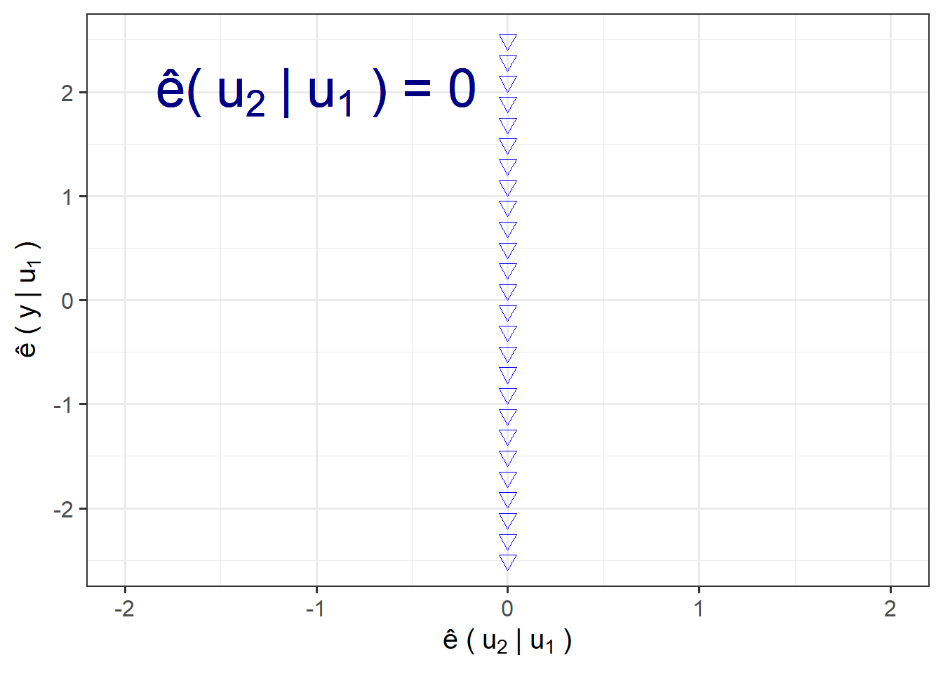
Variance-Covariance matrix
A variance-covariance matrix is a square matrix showing the variances and covariances of your model variables. The diagonal elements of the matrix contain the variances of your variables, and the off-diagonal values show the covariances between pairs of variables.
To create the matrix, use the function vcov from the package stats already installed in R by default.
vcov(fit.lm)
##              (Intercept)          Wind       Solar.R         Ozone
## (Intercept) 10.339599186 -0.6607207525 -5.880952e-03 -0.0537960883
## Wind        -0.660720753  0.0544122038 -2.082856e-04  0.0037619476
## Solar.R     -0.005880952 -0.0002082856  5.894641e-05 -0.0000698867
## Ozone       -0.053796088  0.0037619476 -6.988670e-05  0.0006964252
Now, notice the existing difference with a normal correlation matrix.
psych::corr.test(airquality[,1:4],use = "pairwise",method = "spearman")$r #relationship between all your variables
## Ozone Solar.R Wind Temp
## Ozone 1.0000000 0.3481864700 -0.5901551241 0.7740430
## Solar.R 0.3481865 1.0000000000 -0.0009773325 0.2074275
## Wind -0.5901551 -0.0009773325 1.0000000000 -0.4465408
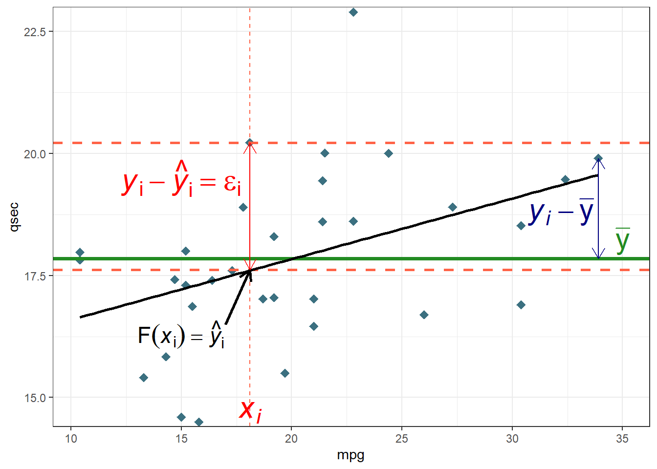
## Temp 0.7740430 0.2074275160 -0.4465407773 1.0000000Regression Graph
ggplot(mtcars,aes(x=mpg,y=qsec))+
  geom_point(shape=18,colour="#3B7080",size=3)+
  geom_vline(xintercept =18.1,linetype="dashed",colour="tomato")+
  geom_hline(yintercept = c(20.22,17.62,17.84875),
             linetype=c("dashed","dashed","solid"),
             colour=c("tomato","tomato","forestgreen"),
             size=c(1,1,1.3))+
  geom_smooth(method="lm",se=F,colour="black")+
  annotate("segment",yend = 17.62,y=16.5,x=17,xend=18.1,colour="black",size=1,arrow=arrow(length = unit(0.03,"npc")))+
  annotate("segment",yend = c(19.90,20.22),
           y=c(mean(mtcars$qsec),17.62),
           x=c(33.9,18.1),xend=c(33.9,18.1),
           colour=c("navy","red"),
           arrow=arrow(ends = "both",length = unit(0.03,"npc")))+
  annotate("text",x=18.1,y=14.7,
           label=bquote( italic(x[i])),colour="red",size=8)+
  annotate("text",x=15,y=16.3,
           label=expression("F(italic(x)[i])== hat(italic(y))[i]"),parse=T,colour="Black",size=6)+
  annotate("text",x=c(35,32.2,15),y=c(18.2,18.8,19.5),
           label=c(expression("bar(y)"), #mean
           expression("italic(y[i])-bar(y)"), #text 2
           expression( "italic(y)[i]-hat(italic(y))[i]==epsilon[i]")), # obs-mean text 3
           parse=T, #must be included to have the right format
           colour=c("forestgreen","navy","red"), #different colours for each text
           size=8)+ #point - mean
  scale_y_continuous(expand = c(0,0.1))+
  theme_bw()