👩 This week we will use the following packages as always, load them at the beginning of the session 👨
library(tidyverse)
library(car)
library(outliers)
library(dae) #install.packages("dae")
library(car)
library(DMwR)
library(olsrr)
library(stats)
library(ggrepel)
library(ggstatsplot)
library(plotly)
#install.packages("package_name")
This week, we will look at observations with high influence on the regression. They can change the distribution of residuals or significantly reduce the variation explained by the model \(R^2\).
Separated or outlying points can cause us to miss significant trends by reducing visual resolution in the plots. They also have a considerable influence on the results of the analysis.
Some methods to deal with them:
- Transformations of the data to more suitable scales
- Temporarily removing them from the plot
Univariate
Boxplot
Boxplots are great graphs to visualize outliers. Most of them identify outliers when those observations lie outside \(1.5 * IQR\). The IQR (Inter Quartile Range) is the value difference between 75th and 25th quartiles. In a boxplot, we will look at the points outside the whiskers.
data(algae)
outliers<-boxplot.stats(algae$Cl)$out
boxplot(algae$Cl, main="Pressure Height", boxwex=0.1)
mtext(paste("Outliers: ", paste(outliers, collapse=", ")), cex=0.5,at = c(0.8,300),outer = F)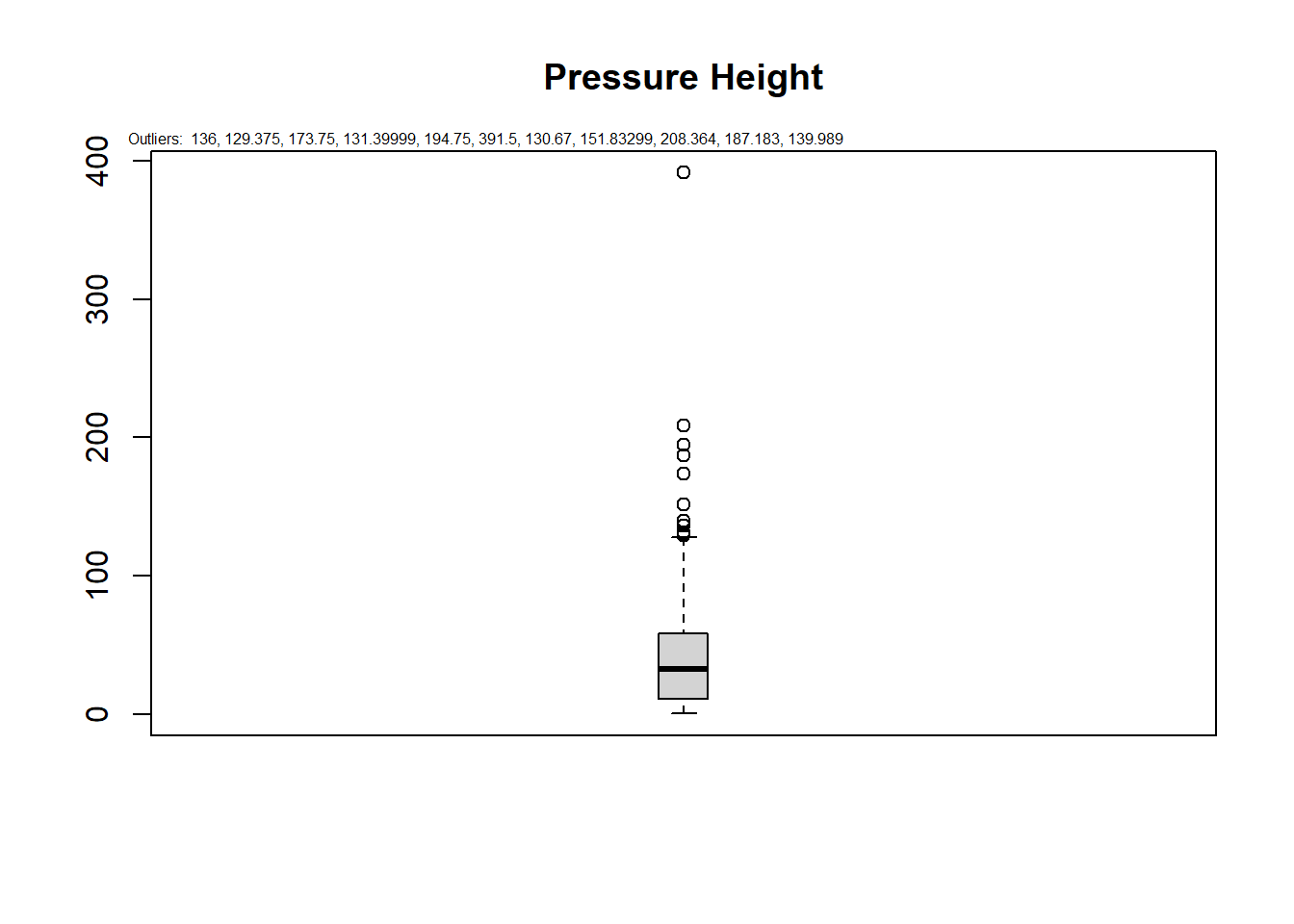
calculate_outlier <- function(x) {
  return(x < quantile(x, 0.25) - 1.5 * IQR(x) | x > quantile(x, 0.75) + 1.5 * IQR(x))
}

data("algae")
outlier.data<-  dplyr::mutate(algae,obs=seq_along(algae$season))%>%
                gather(key = "variables",value = "values",4:18,na.rm = T)%>%
                dplyr::group_by(variables)%>%
                dplyr::mutate(outlier=ifelse(calculate_outlier(values),obs,NA))

ggplot()+
  geom_boxplot(outlier.data,mapping=aes(x=variables,y=values))+
  geom_text_repel(outlier.data,mapping=aes(x=variables,y=values,label=outlier))+
  facet_wrap(variables~.,scales = "free")+
  theme_bw()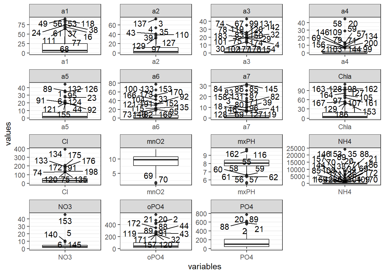
geom_text_repel does not work as expected, so we use geom_text and move the text to the right to have some space between the points.
p=ggplot(outlier.data)+
  geom_boxplot(mapping=aes(x=variables,y=values))+
  geom_text(mapping=aes(x=variables,y=values,label=outlier),nudge_x = 0.1)+
  facet_wrap(variables~.,scales = "free")+
  theme_bw()
plotly::ggplotly(p)
Multivariate model
Cook’s Distance
Cook’s distance is a mathematical measure of the impact of deleting a case on the estimated regression coefficients not a statistical test. Each case or sample has one Cook’s distance \(D\) value, and the plot orders them in terms of their influence on the fitted \(hat_y\).
It is generally helpful to study cases with \(D_i>0.5\) and essential to review cases with \(D_i>1\).
fit1<-lm(NO3~mxPH+Cl,data=algae) #
cooksd <- cooks.distance(fit1) #store the D of each point in a named numeric form
plot(cooksd, pch="*", cex=2, main="Influential Obs by Cooks distance")  # plot cook's distance
abline(h = 4*mean(cooksd, na.rm=T), col="red")  # add cutoff line
text(x=1:length(cooksd)+1, y=cooksd, col="red",adj = c(0.15,0.1),
     labels=ifelse(cooksd>4*mean(cooksd, na.rm=T),names(cooksd),""))  # add labels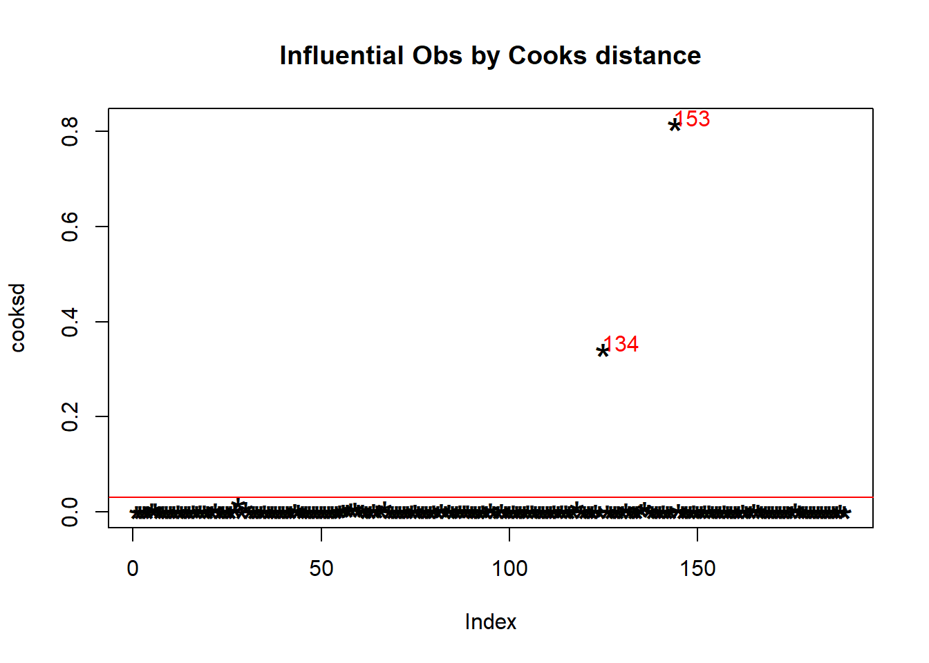
Get the information about these extreme observations.
influential=cooksd[cooksd>(4*mean(cooksd, na.rm=T))]  # get the influential row numbers
filtered_data<-algae[-which(row.names(algae) %in% names(influential)),] #remove the rows inside influential
head(algae[names(influential), ])  # influential observations.
##     season   size  speed mxPH mnO2      Cl    NO3   NH4 oPO4 PO4 Chla  a1  a2
## 134 spring medium medium  7.9  8.3 391.500  6.045   380  173 317  5.5 2.4 1.7
## 153 autumn medium   high  7.3 11.8  44.205 45.650 24064   44  34 53.1 2.2 0.0
##      a3  a4  a5   a6  a7
## 134 4.2 8.3 1.7  0.0 2.4
## 153 0.0 1.2 5.9 77.6 0.0
We do not have a variable unique to each observation, so we will need to use row.names() as well as the names(), which takes the row number for each value inside influential.
We can use a different package for this style of plot.
a=olsrr::ols_plot_cooksd_chart(model = fit1,print_plot = T)+
    theme_bw()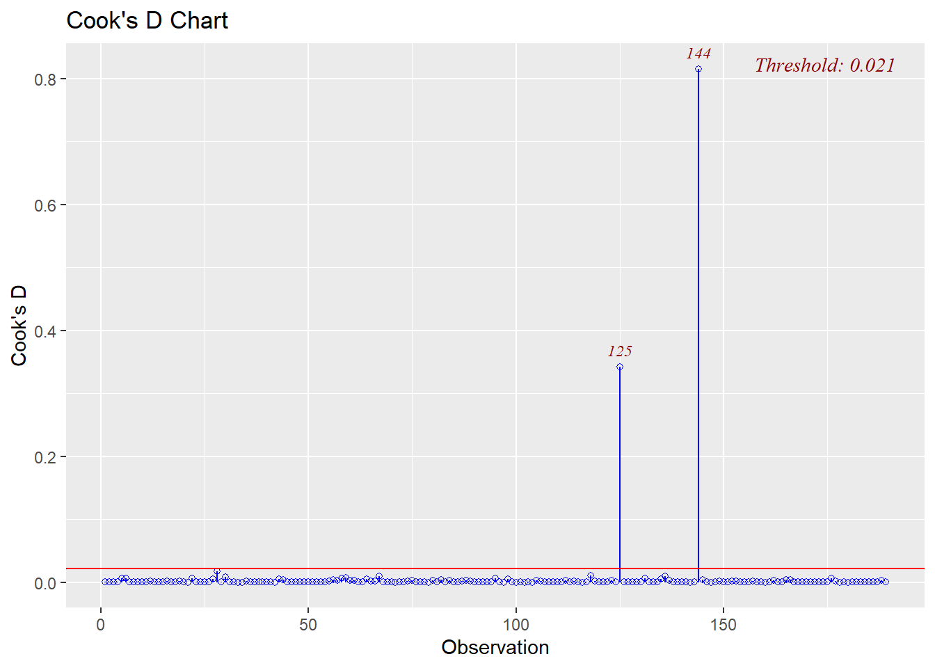
In this case we got values that are different to the rows in the main data set so we can have a look at the plot data to get the actual rows.
values=row.names(a$data[(a$data$fct_color=="outlier"),])
values
## [1] "134" "153"
fit2<-lm(NO3~mxPH+Cl,data=algae[-as.integer(values),]) #our second regression
Test for outliers
The function outlierTest from the car package gives the most extreme observation based on the given model using the Bonferroni Outlier Test.
car::outlierTest(fit1,n.max=Inf) #the largest influence cause by this value
##     rstudent unadjusted p-value Bonferroni p
## 153 19.80916         1.3401e-47   2.5328e-45
fit3<-lm(NO3~mxPH+Cl,data=algae[-153,]) #remove that observation
car::outlierTest(fit3) #the largest influence in the new model
## No Studentized residuals with Bonferroni p < 0.05
## Largest |rstudent|:
##   rstudent unadjusted p-value Bonferroni p
## 5 3.490858         0.00060268       0.1133
With the package Outliers, we calculate the extreme observations. First, let’s look at the extremest value with outlier.
outlier(algae$Cl)
## [1] 391.5
Use the scores function to calculates standard, t, chi-squared, IQR, and MAD scores of given data.
head(scores(na.omit(algae$Cl), type="chisq"))
## [1] 0.134322963 0.090826050 0.005962813 0.518682218 0.062562936 0.222972355
We can test which observations are beyond a given probability (percentile).
head(scores(na.omit(algae$Cl), type="chisq",prob = 0.95),40)
##  [1] FALSE FALSE FALSE FALSE FALSE FALSE FALSE FALSE FALSE FALSE FALSE FALSE
## [13] FALSE FALSE FALSE FALSE FALSE FALSE FALSE FALSE FALSE FALSE FALSE FALSE
## [25] FALSE FALSE FALSE FALSE FALSE FALSE FALSE FALSE FALSE FALSE FALSE FALSE
## [37] FALSE FALSE FALSE FALSE
Regression changes
Let’s have a look at the results when we removed those observations
summary(fit1)
##
## Call:
## lm(formula = NO3 ~ mxPH + Cl, data = algae)
##
## Residuals:
##    Min     1Q Median     3Q    Max
## -4.663 -1.690 -0.653  0.998 41.118
##
## Coefficients:
##              Estimate Std. Error t value Pr(>|t|)
## (Intercept) 14.967838   4.465959   3.352 0.000973 ***
## mxPH        -1.553475   0.555257  -2.798 0.005688 **
## Cl           0.020465   0.005797   3.530 0.000524 ***
## ---
## Signif. codes:  0 '***' 0.001 '**' 0.01 '*' 0.05 '.' 0.1 ' ' 1
##
## Residual standard error: 3.692 on 186 degrees of freedom
##   (11 observations deleted due to missingness)
## Multiple R-squared:  0.08793,    Adjusted R-squared:  0.07813
## F-statistic: 8.966 on 2 and 186 DF,  p-value: 0.0001916
summary(fit2)
##
## Call:
## lm(formula = NO3 ~ mxPH + Cl, data = algae[-as.integer(values),
##     ])
##
## Residuals:
##     Min      1Q  Median      3Q     Max
## -3.2280 -1.4335 -0.6096  1.1214  6.9952
##
## Coefficients:
##              Estimate Std. Error t value Pr(>|t|)
## (Intercept)  9.360844   2.535633   3.692 0.000293 ***
## mxPH        -0.903745   0.316165  -2.858 0.004748 **
## Cl           0.024284   0.003901   6.225 3.17e-09 ***
## ---
## Signif. codes:  0 '***' 0.001 '**' 0.01 '*' 0.05 '.' 0.1 ' ' 1
##
## Residual standard error: 2.072 on 184 degrees of freedom
##   (11 observations deleted due to missingness)
## Multiple R-squared:  0.1853, Adjusted R-squared:  0.1765
## F-statistic: 20.93 on 2 and 184 DF,  p-value: 6.464e-09
We can see changes in the estimates as in the \(Adjusted R^2\).
Finally, the function plot is excellent to test distribution, variance, or outliers.
par(mfrow=c(2,2))
plot(fit1)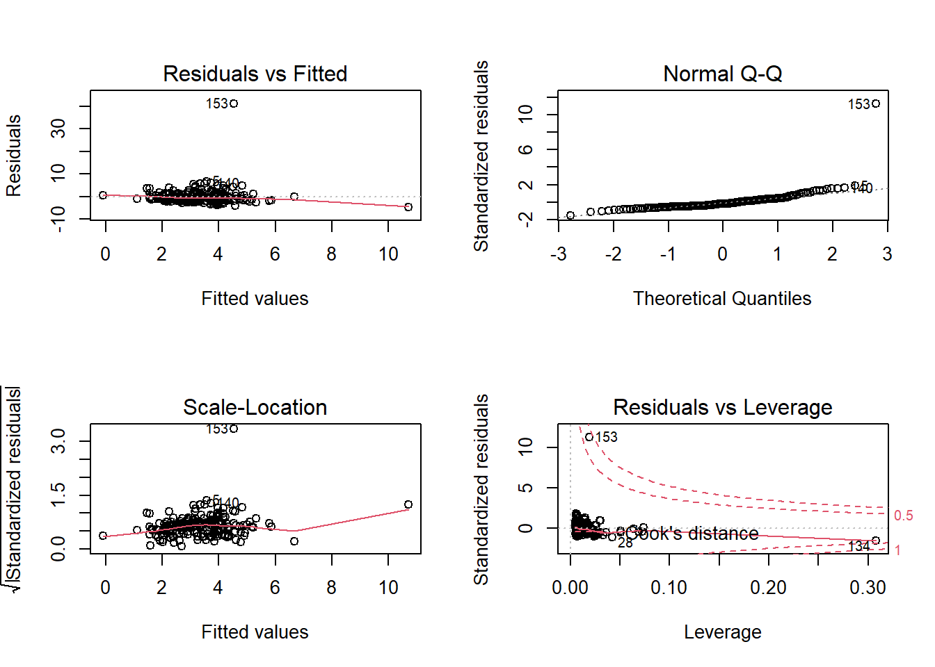
par(mfrow=c(2,2))
plot(fit2)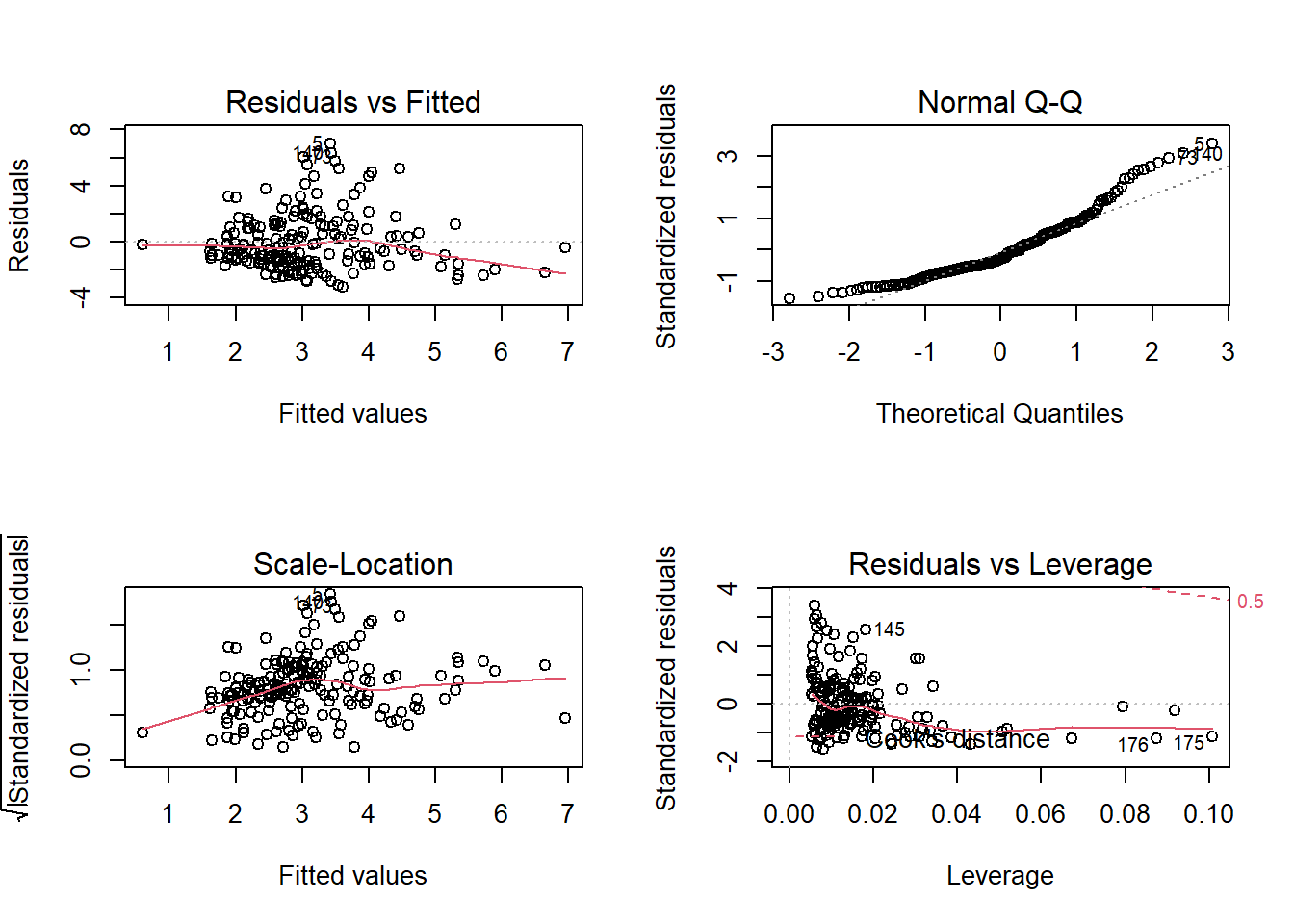
More detailed information
Recent packages integrate more complex statistics to ggplot2. We can have a look at the boxplots created with ggstatsplot.
library(ggstatsplot)
ggbetweenstats(algae,x = season,y=Cl,outlier.tagging = T)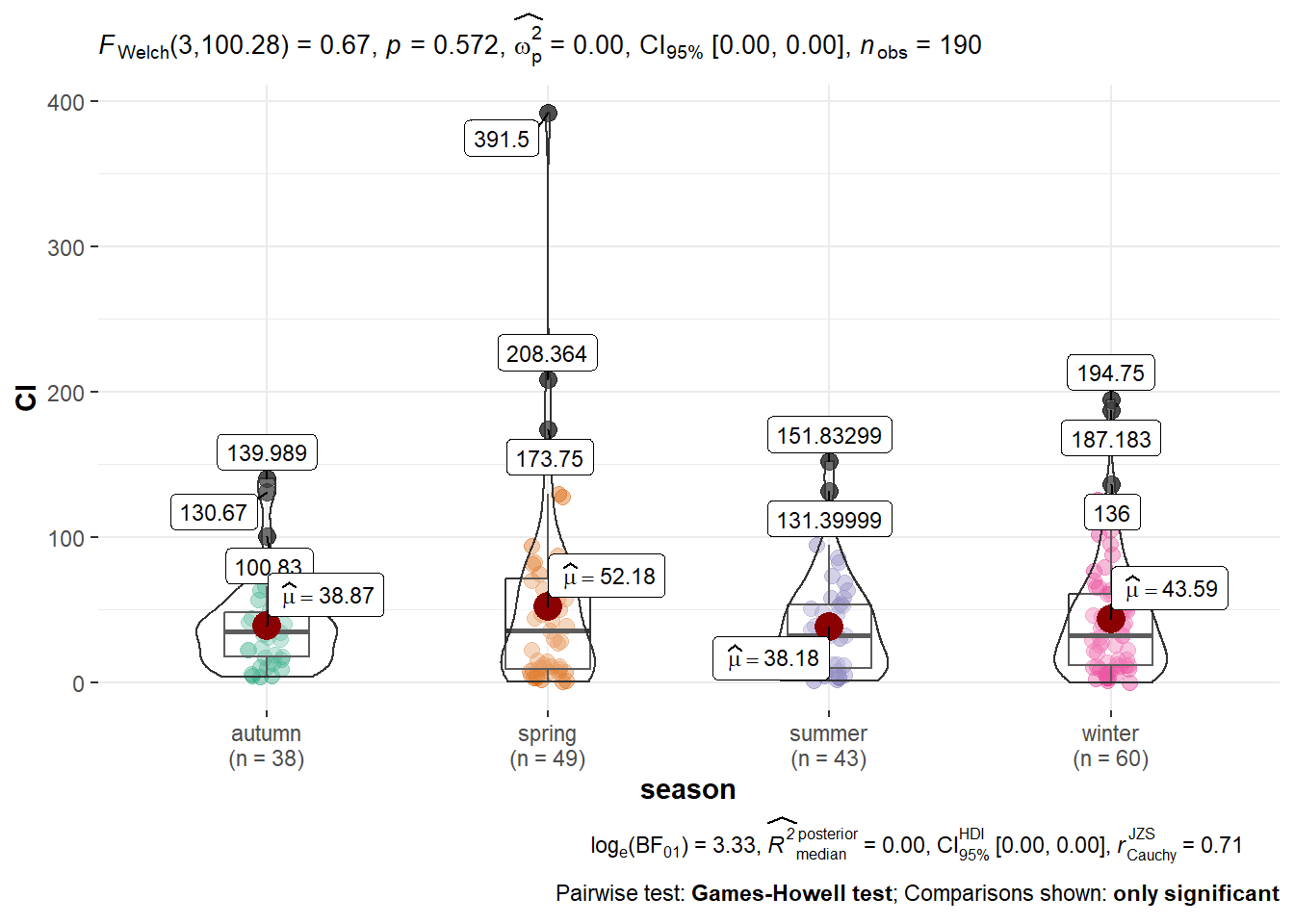
We have some outliers, so we can try removing them
Q <- quantile(algae$Cl, probs=c(.25, .75), na.rm = T) #calculate 25% and 75%
iqr <- IQR(algae$Cl,na.rm = T) #IQR of the data
eliminated<- subset(algae, algae$Cl > (Q[1] - 1.5*iqr) & algae$Cl  < (Q[2]+1.5*iqr)) #rows with extreme observations out
ggbetweenstats(eliminated, x = season,y =  Cl, outlier.tagging = F) #new plot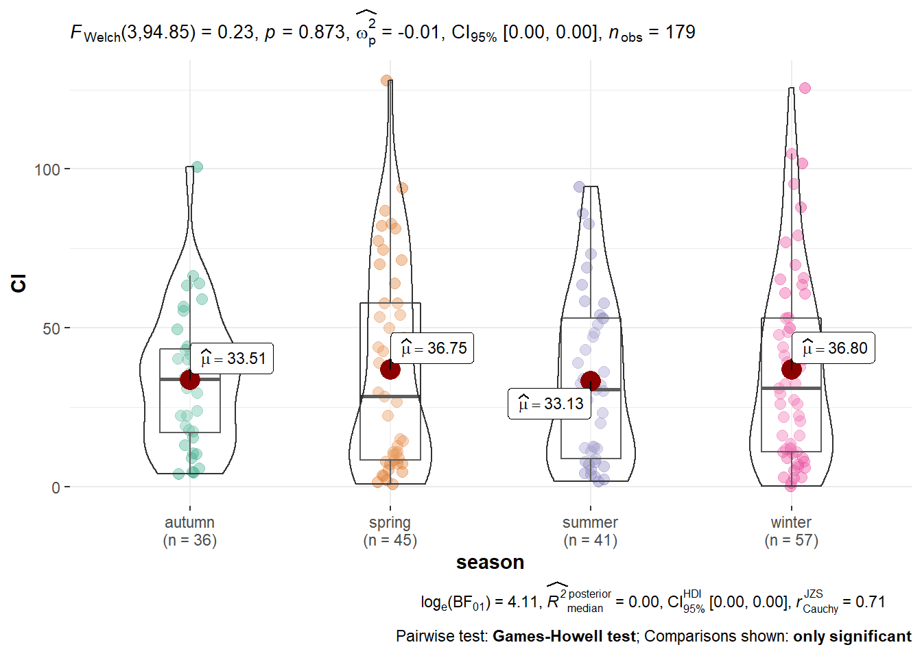
Package description and more information:
ggstatsplotis an extension of theggplot2package for creating graphics with details from statistical tests included in the plots themselves and targeted primarily at the behavioral sciences community to provide a one-line code to produce information-rich plots. In a typical exploratory data analysis workflow, data visualization and statistical modeling are two different phases: visualization informs modeling, and modeling in its turn can suggest a different visualization method, and so on and so forth. The central idea of ggstatsplot is simple: combine these two phases into one in the form of graphics with statistical details, which makes data exploration simpler and faster. Currently, it supports only the most common types of statistical tests (parametric, non-parametric, Bayes Factor, and robust versions of t-test/ANOVA, correlation, regression analyses, contingency tables analyses, and meta-analysis).